Year One

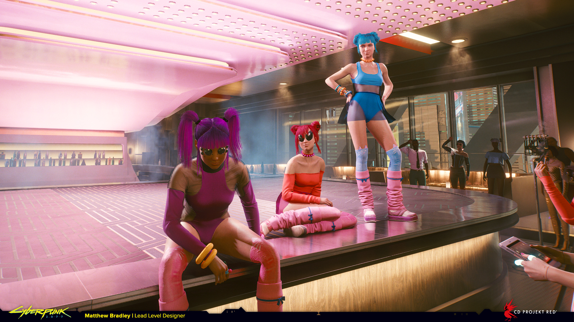
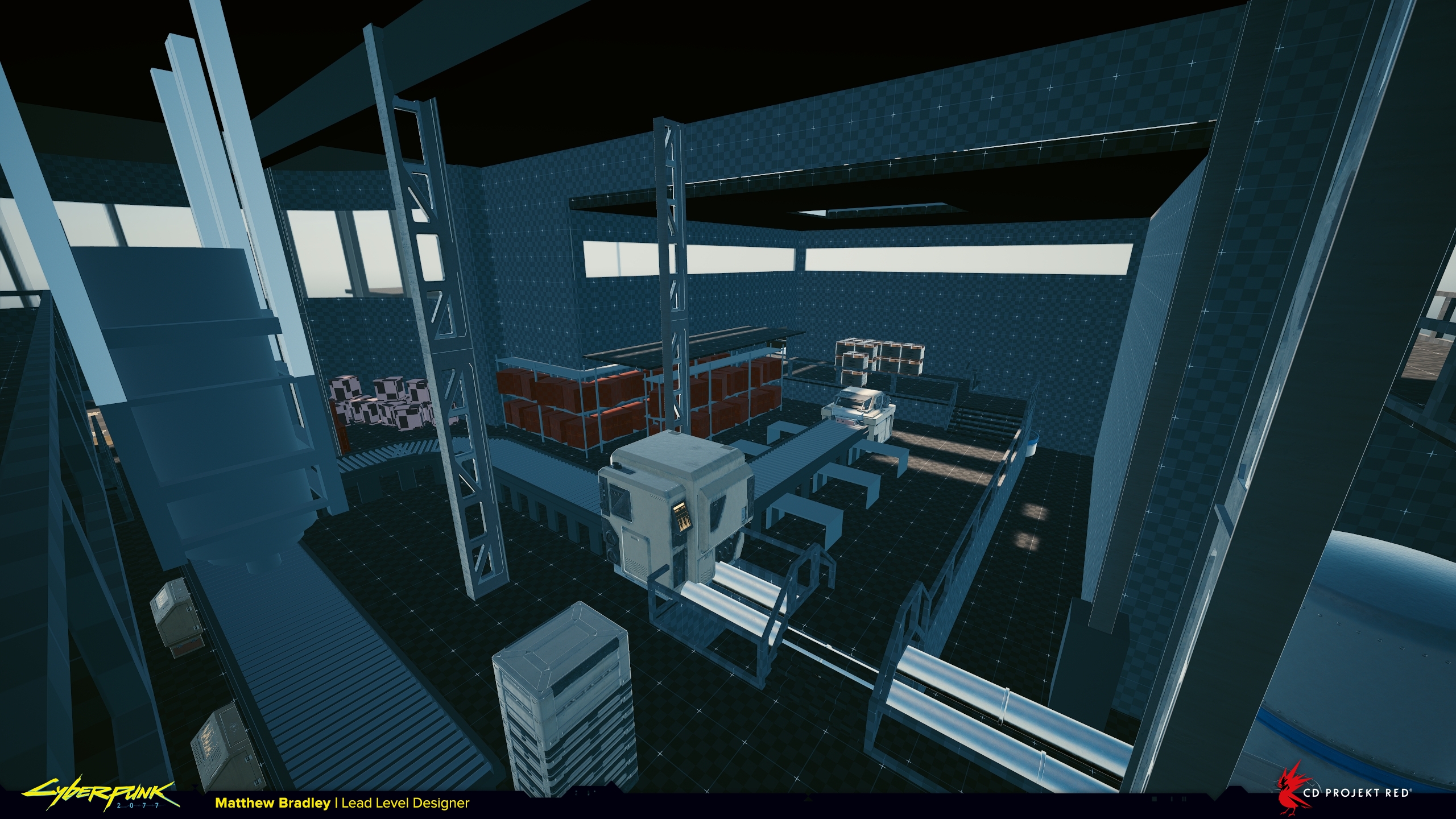
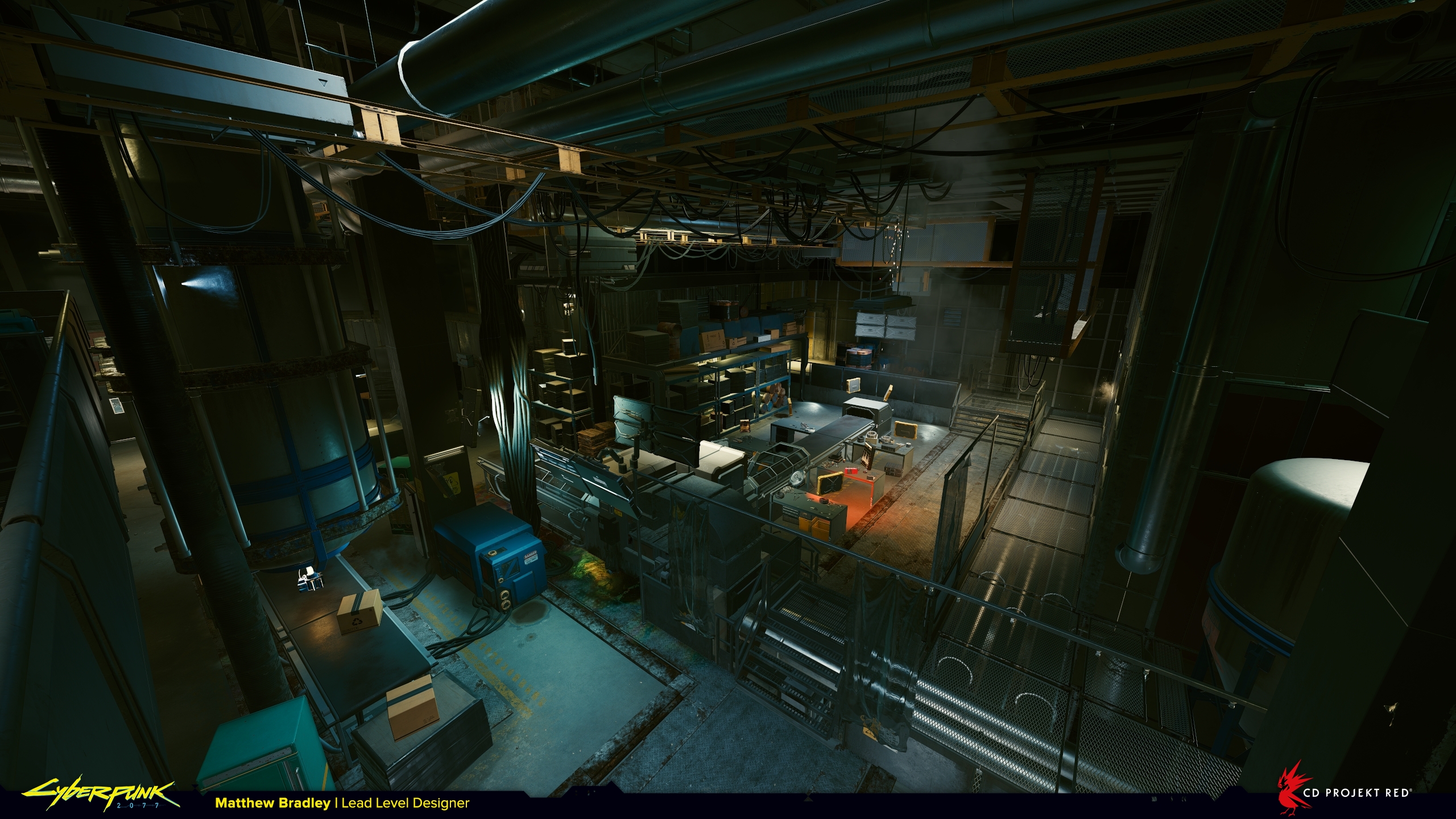
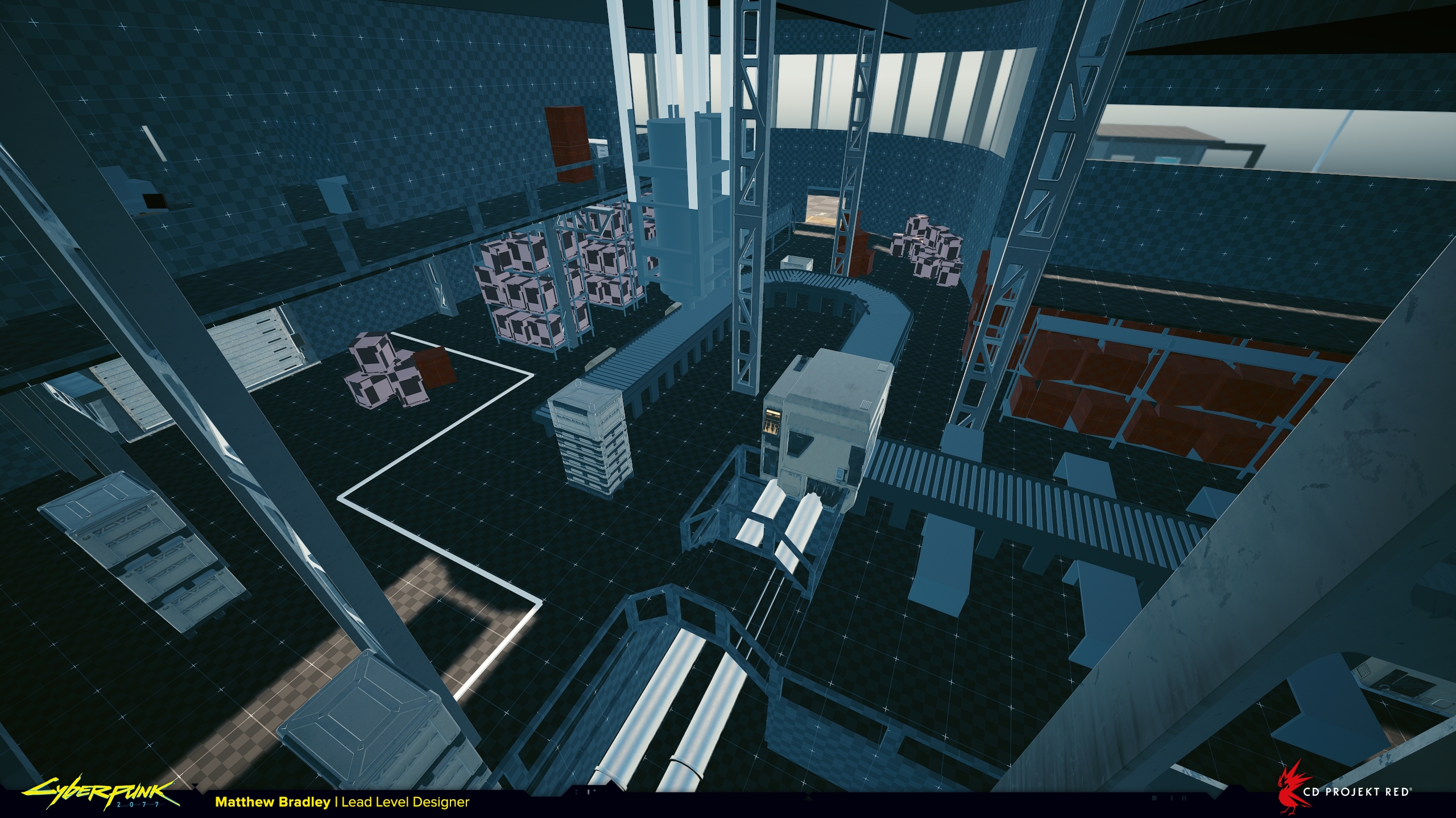
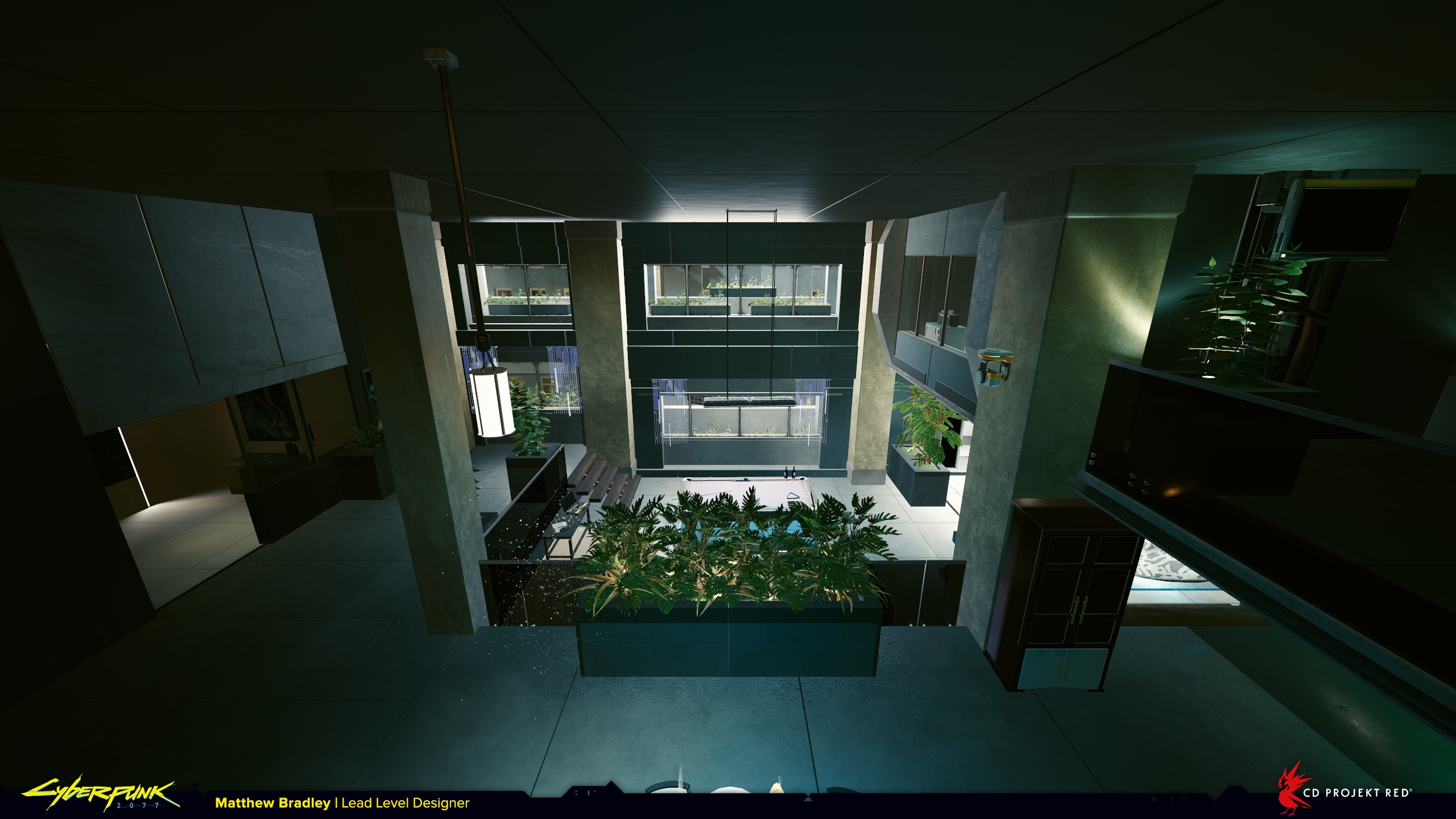
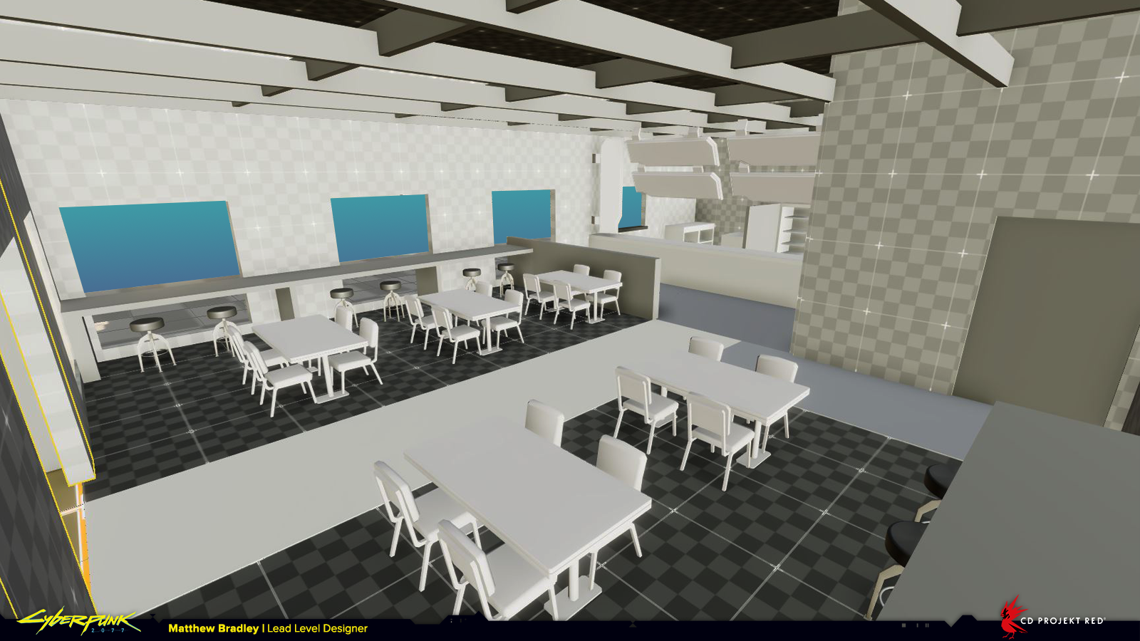
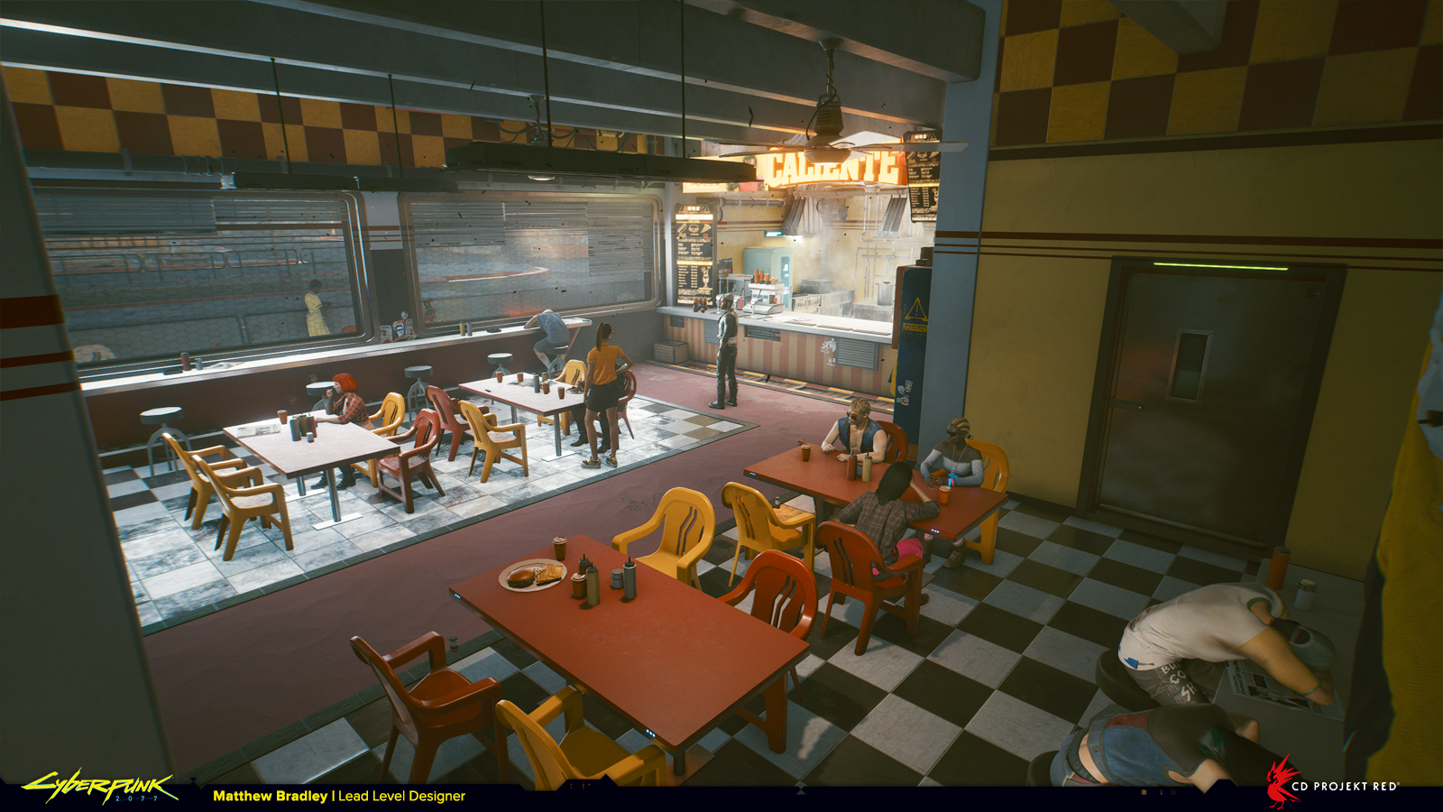
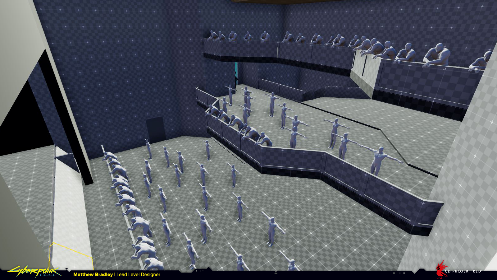
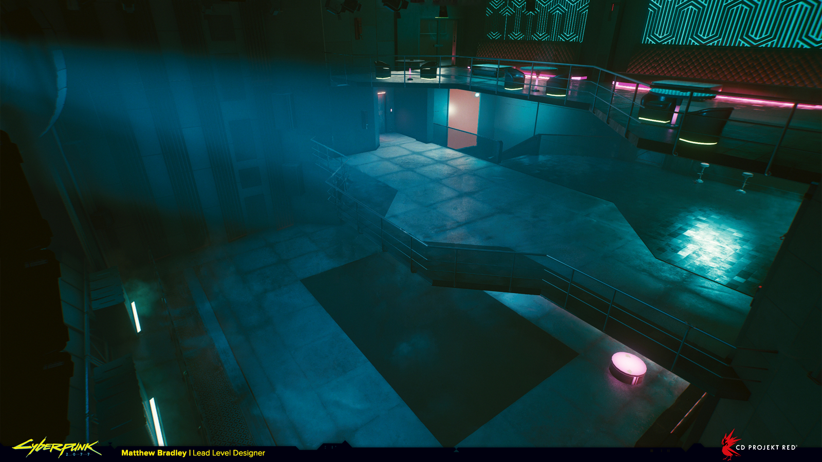
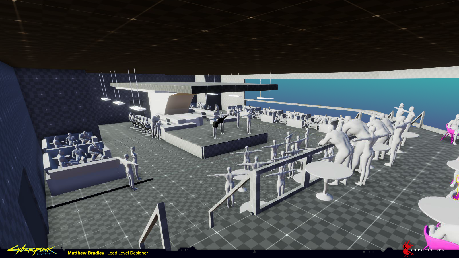
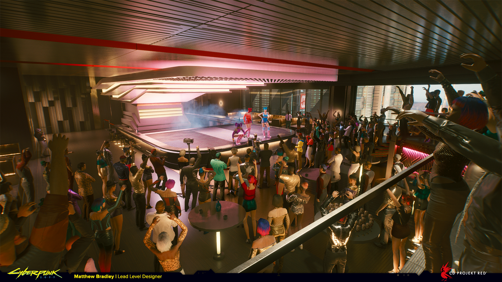
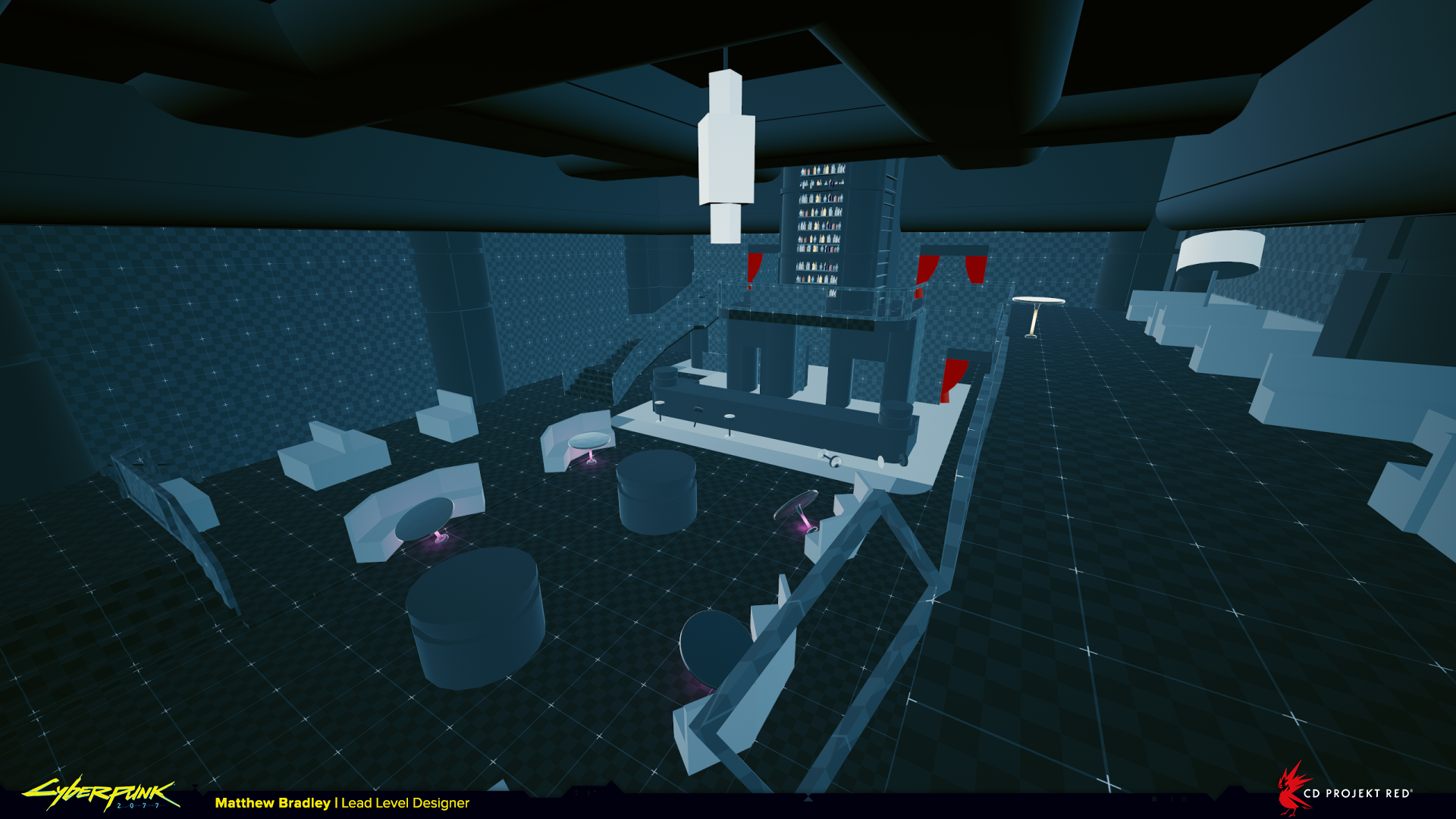
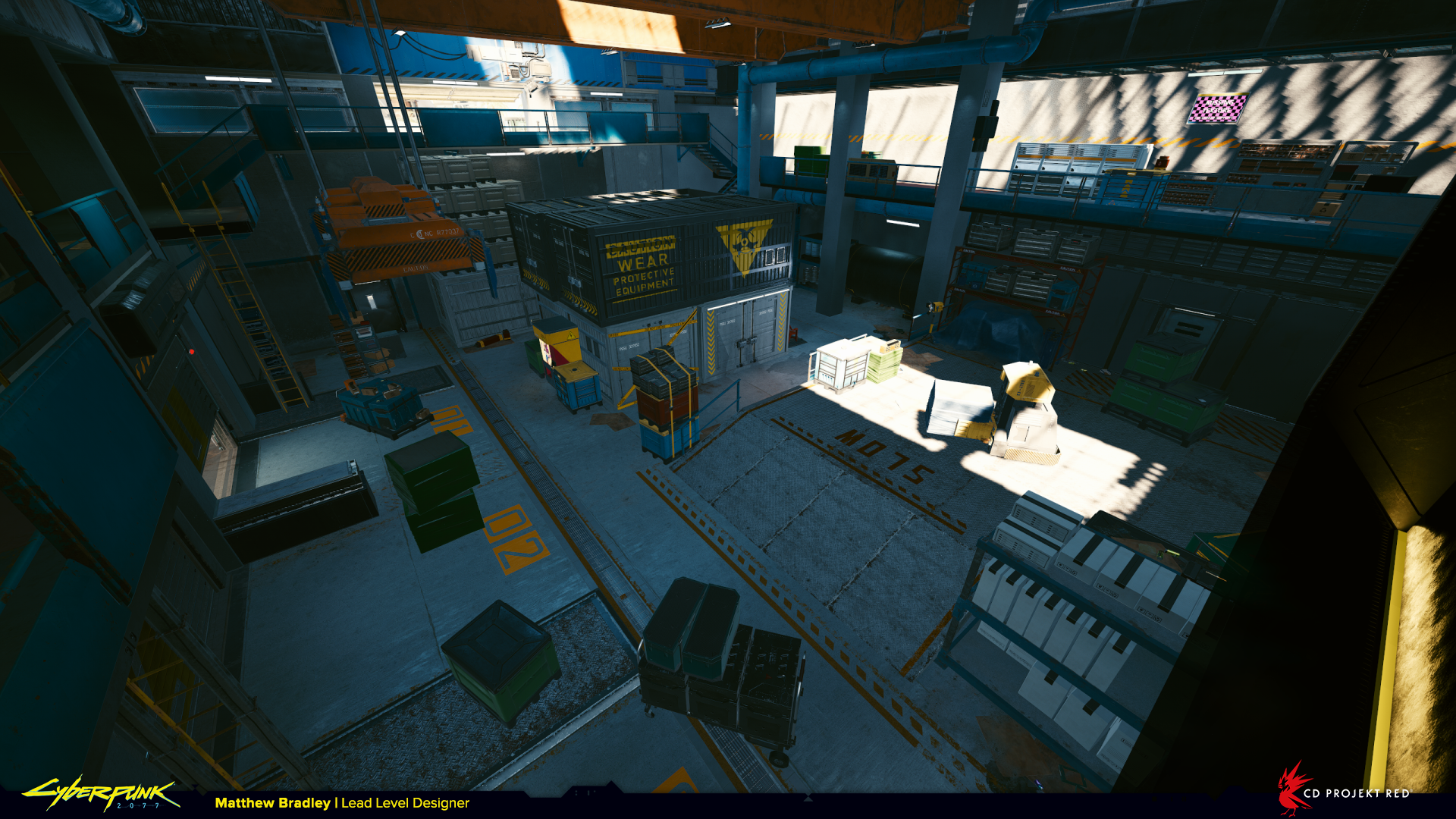
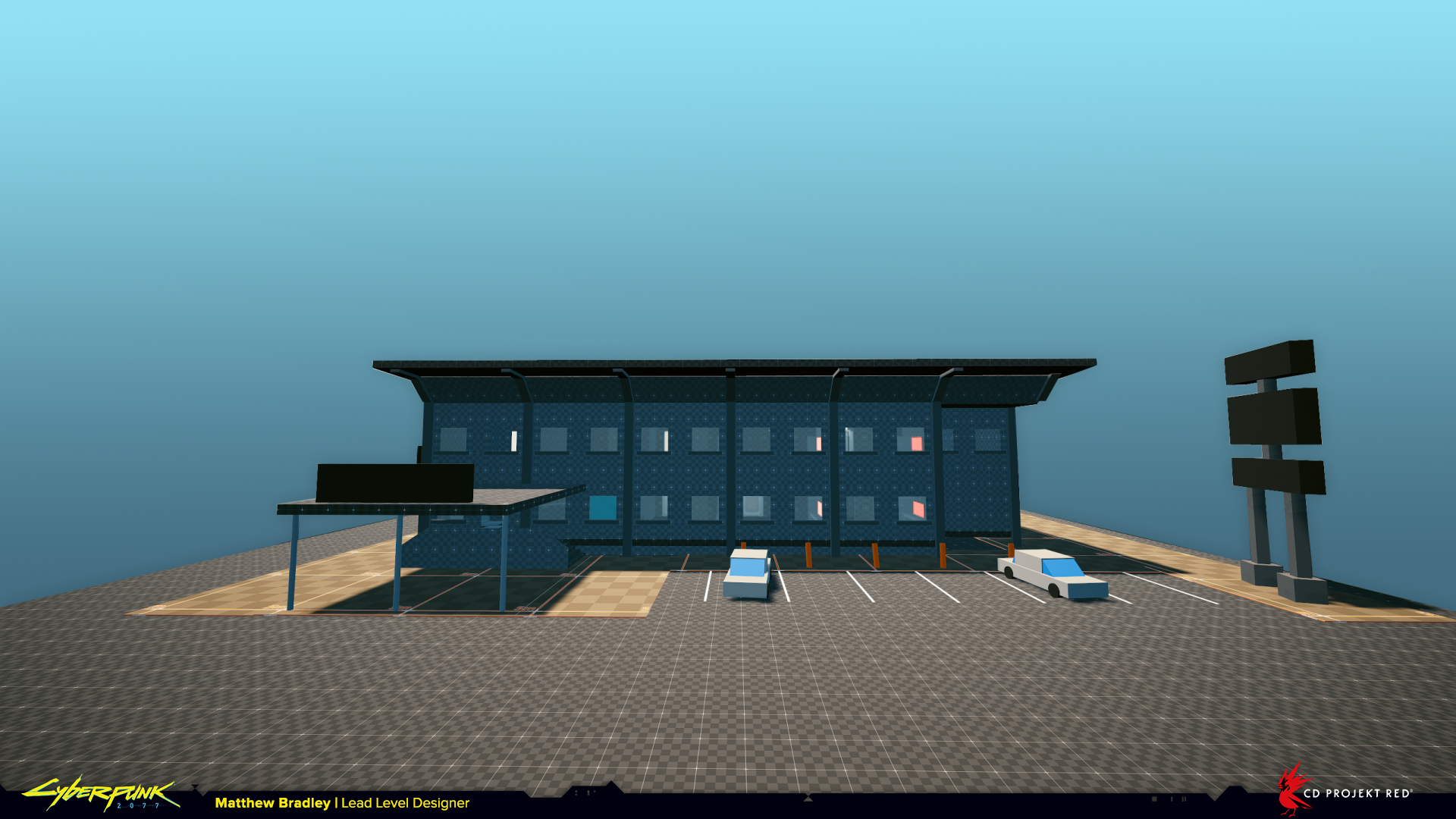
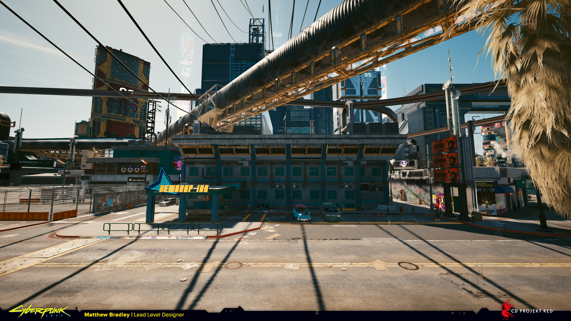
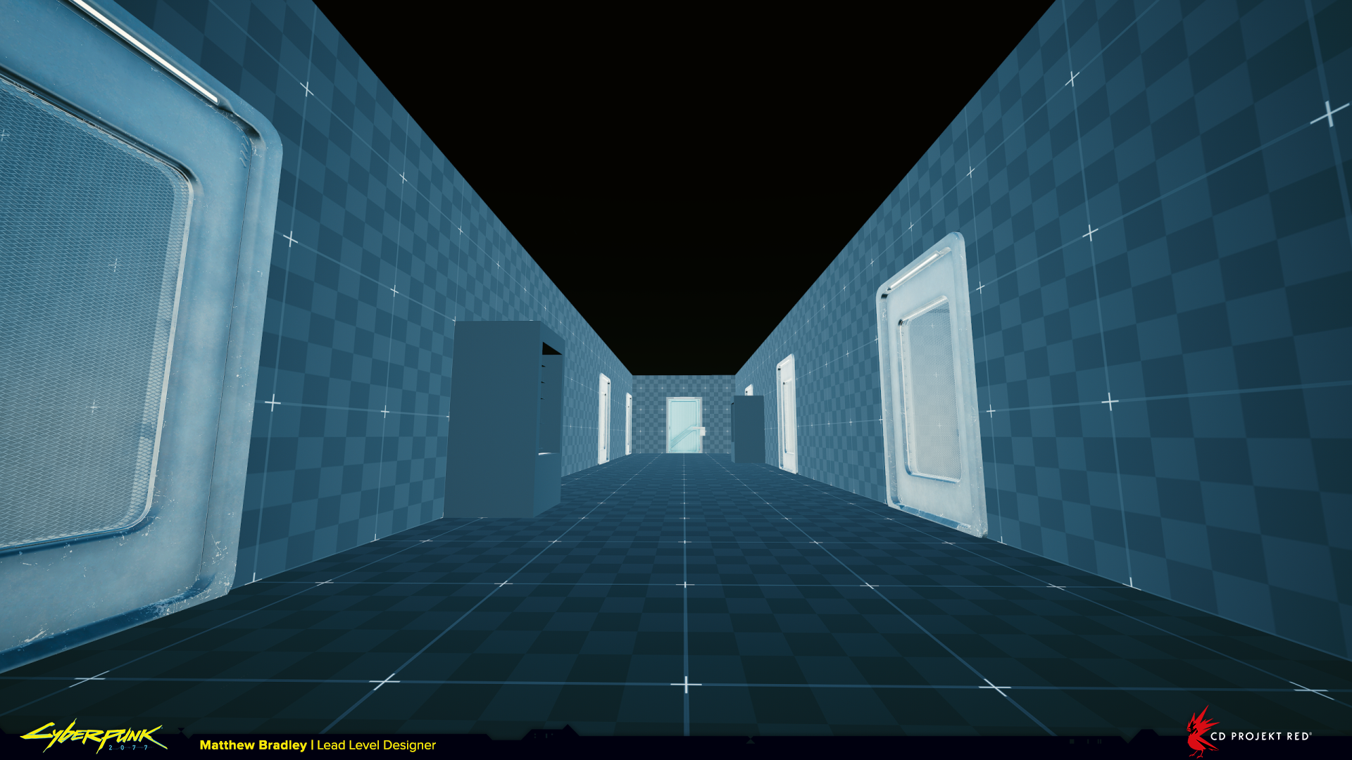
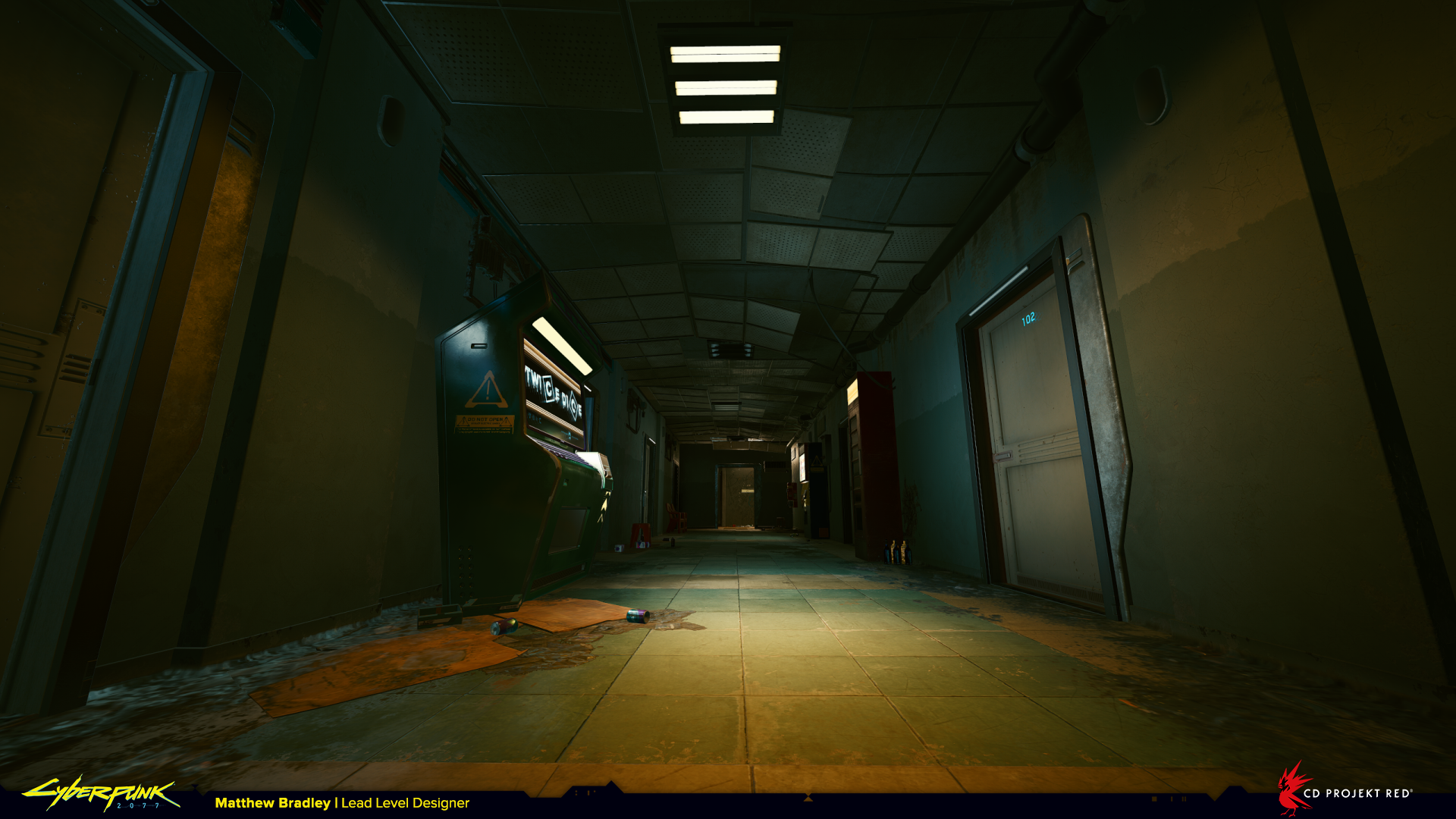
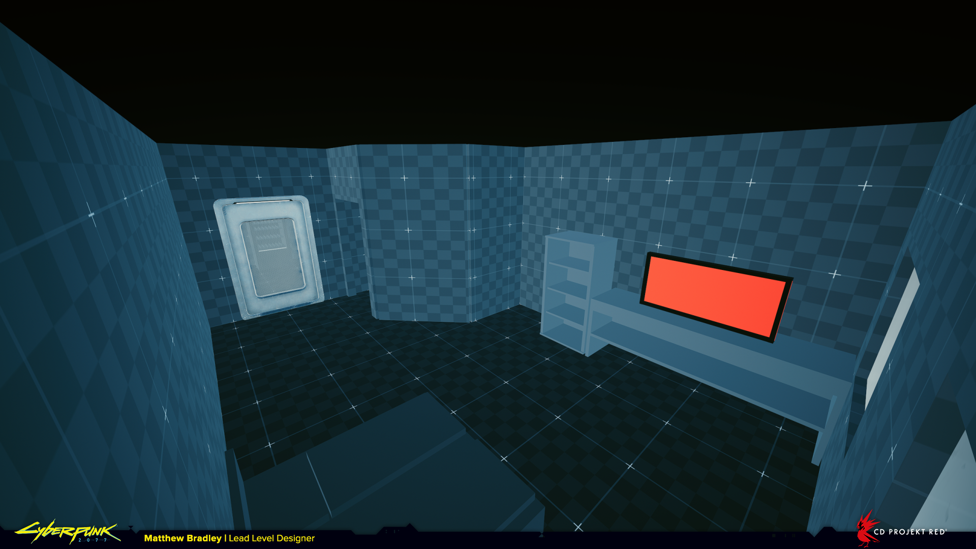
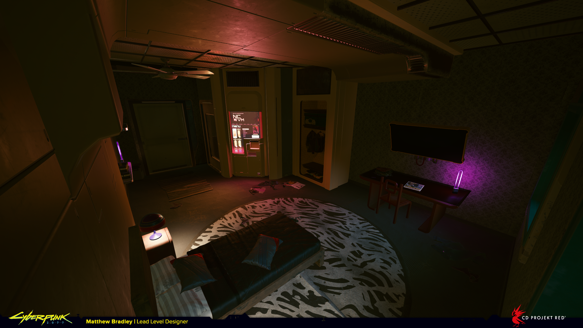
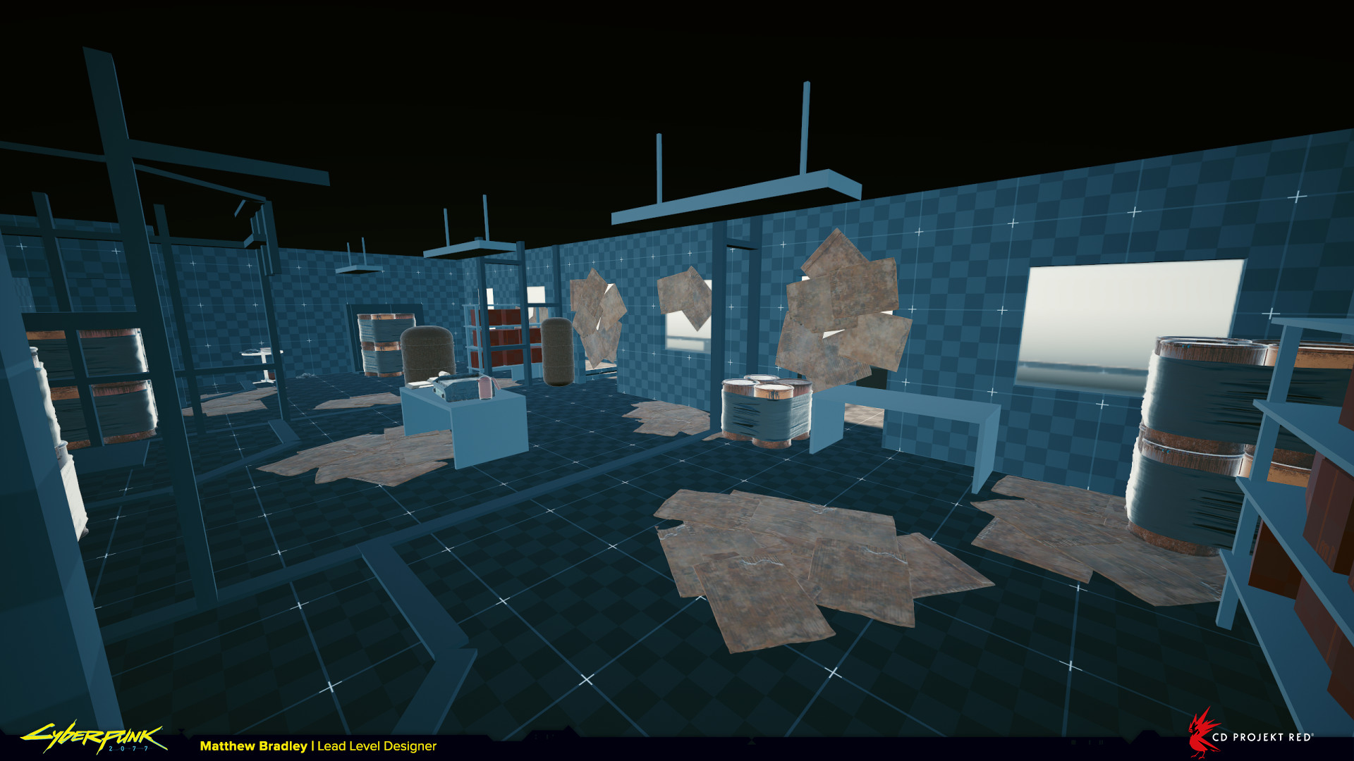
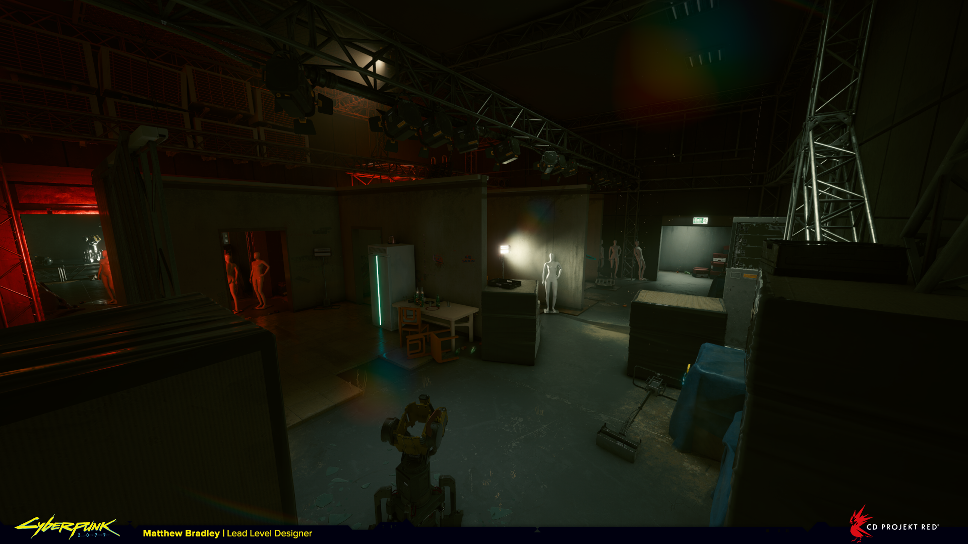
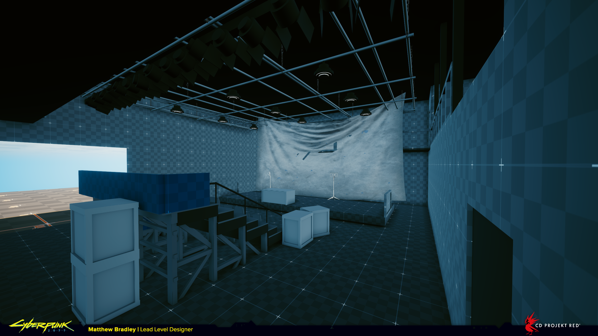
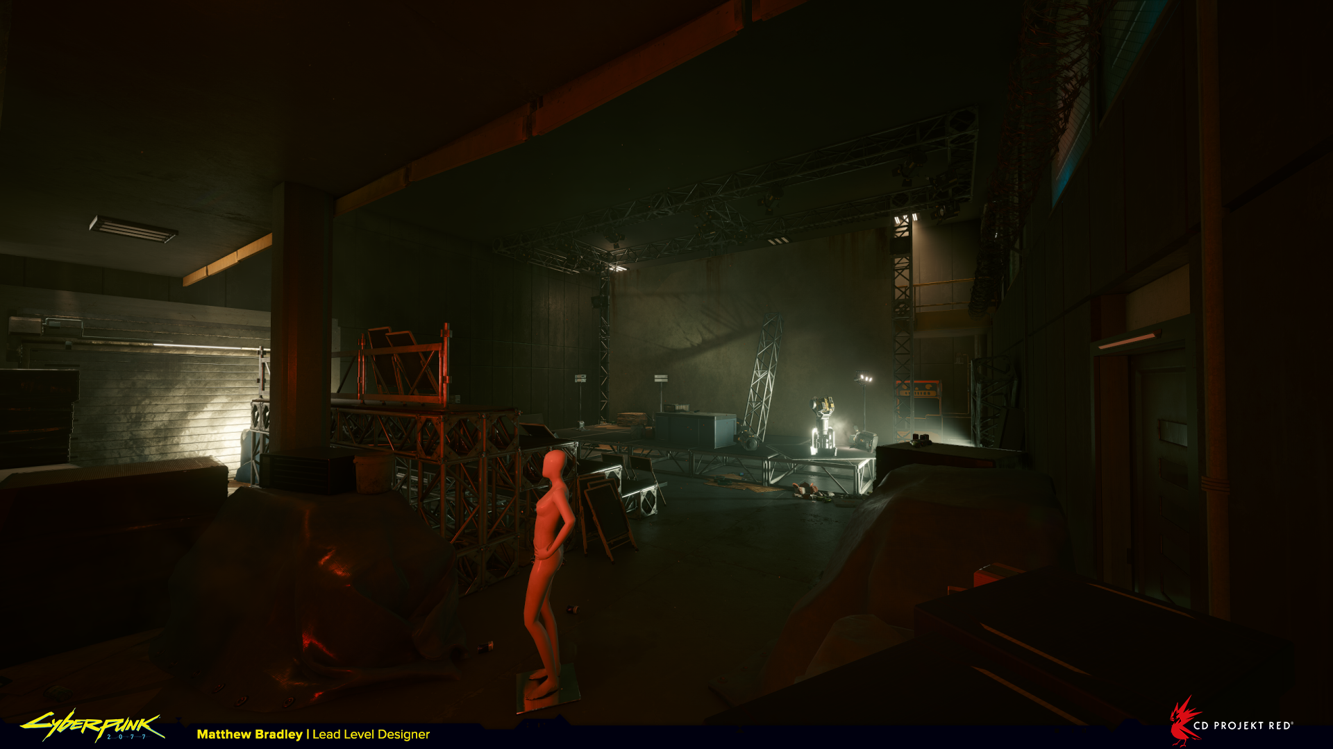
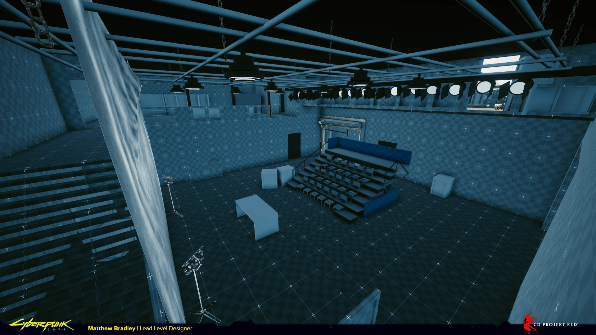
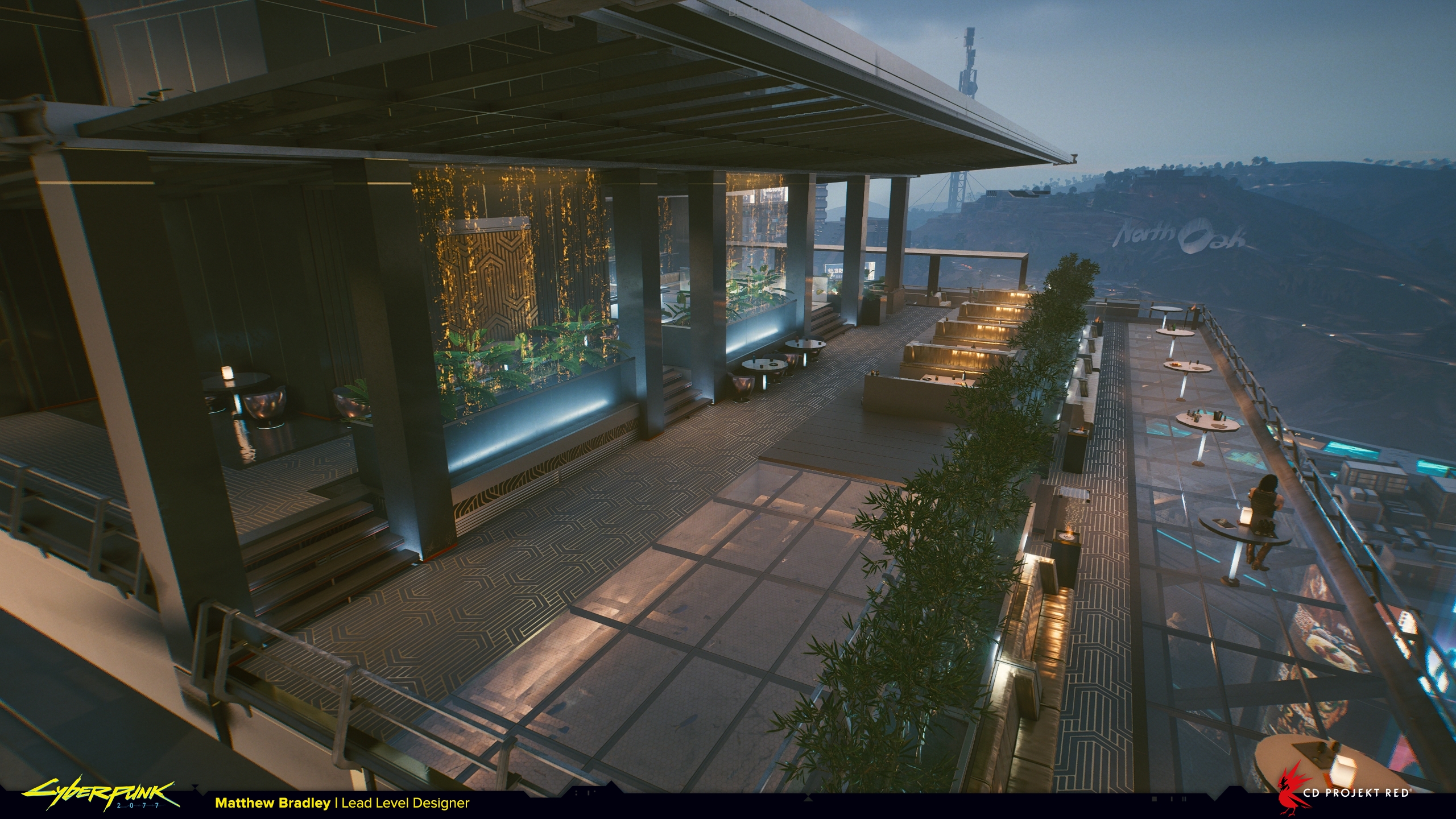
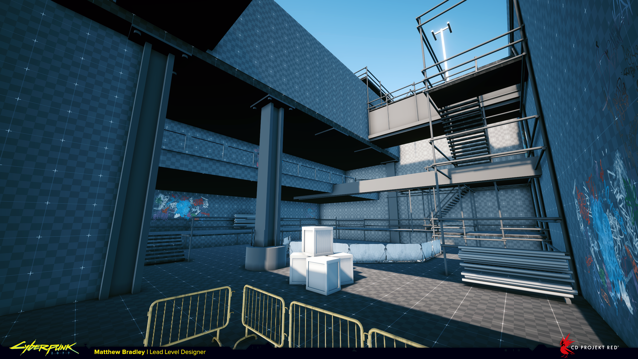
2022 was a super cool year for work and personal development.

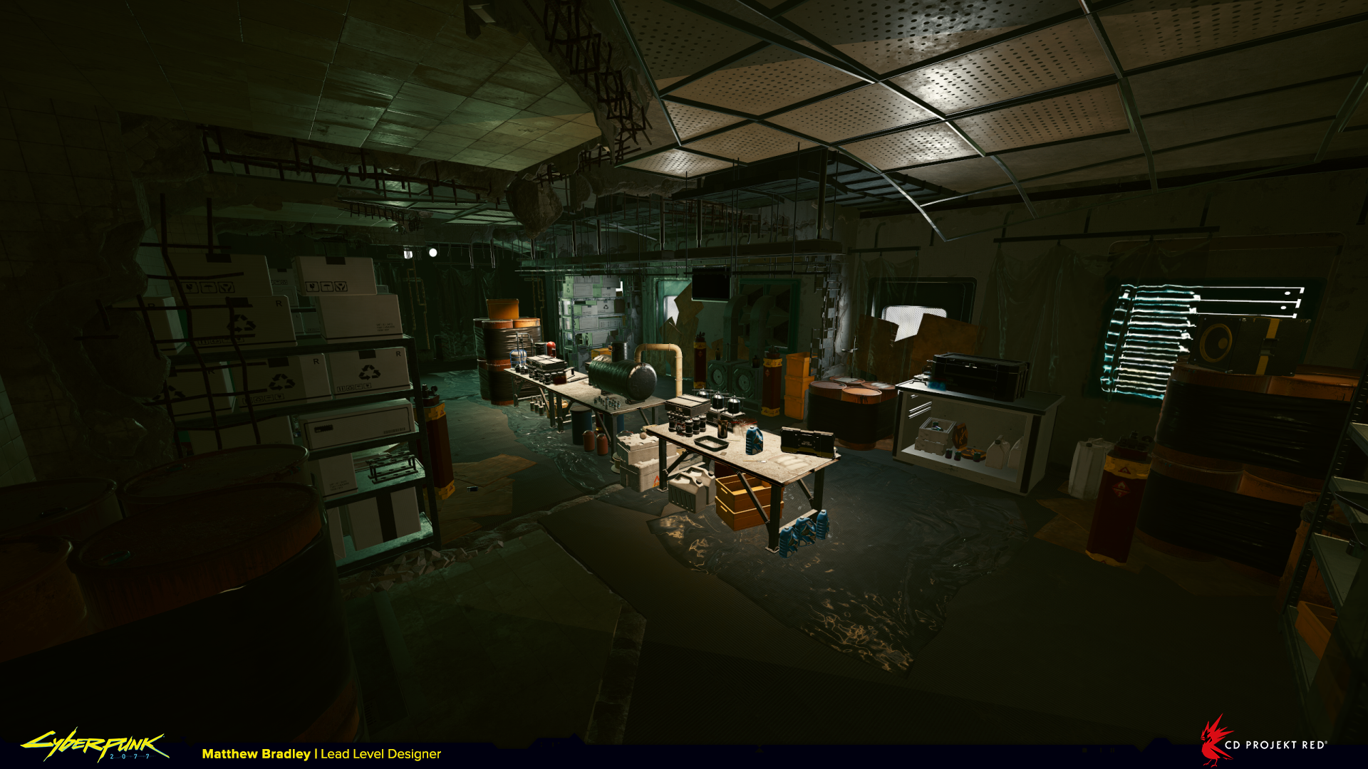
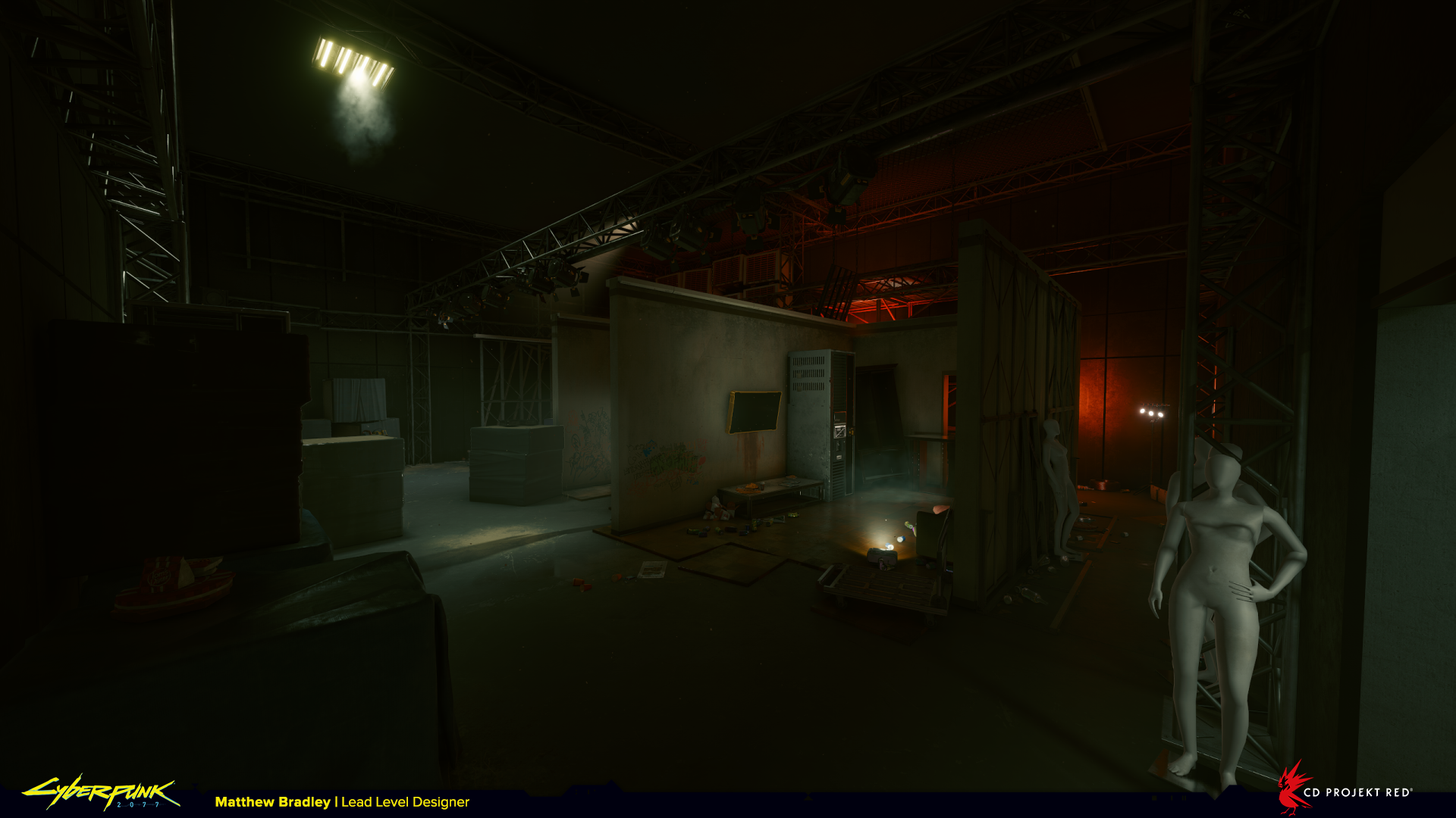
In October I put together this showreel for a talk at ETHLisbon with the Mona team. The presentation focused on my journey as a freelance designer and artist, and the experience was easily one of the best moments of the last 12 months. It felt like a great opportunity to reflect on what has been a creatively rich period in my career. To share it now gives me immense pride.

I never anticipated I would be able to make a living doing the stuff I do, but I’m so grateful to be able to do it.

I’ve met so many good people and got involved with some amazing projects. Can’t wait to see what’s next. Bring on ’23!

Cyberpunk 2077 blockouts before/after – Part 2

Before anything else, thank you to everyone who liked, followed, retweeted, and subscribed following the first part of this series. I appreciate your support!

It’s cool to see people so curious about the process of designing and developing games. In the coming months I’ll be going in to much more detail about how games are made in addition to more specific design-focused content. If you’re interested in how big projects get built and why things turn out the way they do, or you’re looking to get professional tips to polish your level design skills, stick around and I’ve got you covered; subscribe to the YouTube channel and keep a look out for updates on Twitter and Discord.

In part 1 we looked at three quests, in this part we’ll take a look at another four, including narrative-focused locations from the Kerry Eurodyne/Us Cracks storyline. So if you want some accompanying background music to read by, here you go… 😉


Kendachi Factory from ‘Race to the Top’


The request for this mission was to have the player engage in corporate espionage inside an appliance factory, and for budget reasons don’t make it too big. A quick google image search will show you that these kinds of buildings are anything but small!

At CD Projekt Red we went to great lengths to create believable spaces in Night City so they would feel grounded in reality and not be overly sci-fi. But if authenticity is important and we know that usually in real life these kind of factories are huge, why not mirror the reference? Well every single location takes time to build. There’s an entire team of different disciplines who contribute, and while it would be quick for me to make a big, ‘realistic’ level design blockout, doing so would significantly increase the amount of time needed later on from environment artists, lighting artists, quest designers, FX artists, etc.

Being overly-ambitious regarding scale is an easy trap to fall into as a designer. It’s important to remember that even if your design is the most magnificent thing in all creation, it isn’t very successful if it doesn’t meet the brief.

So how do you make it into something affordable, but also believable? There are a couple of options:

  1. 1. Go back to the quest/narrative designer and discuss changing the setting, or
  2. 2. Take the main recognisable elements of the setting and condense them into something more feasible.


In this case I went for the second option and actually in the end what’s being manufactured here is pretty ambiguous. We don’t really see appliances getting made, but what we do see is enough to say something is getting made, and it roughly matches up to our general expectations. The goal is to fulfil the narrative fantasy, not necessarily create a completely accurate 1:1 version of an actual working factory. As long as the level has a decent foundation in real-life reference it’s enough.

On Cyberpunk 2077 the level design team were tasked with making so many warehouses and factories that it became a bit of a running joke. We tried our best to make them varied at least, so for this quest when I came across these amazing illustrations from the 1930’s of streamlined art-deco industrial and commercial architecture I was inspired.

There’s a quote from Bruce Mau I like very much when it comes to using reference:

“Imitate. Don’t be shy about it. Try to get as close as you can. You’ll never get all the way, and the separation might be truly remarkable.”

In every location, before building anything, I collect as many reference images as possible to form a mental vision of the space. Some are useful for the architecture, big features, composition and overall form, some for how the space itself functions, and some just have details I like or find interesting. It’s a bit like a painter loading up their palette with colours. Then when creating the space I’m taking bit’s and pieces from each and mixing them together to make something altogether new.

Above you can see three shots from roughly the same camera angle as the location progresses through different departments. First my level design blockout, then from that the concept artist (in this case the brilliantly talented Marthe Jonkers) takes a screenshot and directly paints-over it to establish the visual style and atmosphere, and finally the art and post teams do their magic based on the concept art.


6th Street warehouse from ‘Arroyo’


This one was made very quickly, I spent around a day on it. I’d like to believe that every next thing I make will be a slight improvement over the last thing, but that’s a really difficult position to take when you have next to no time to deliver something. Accepting that not everything will be a masterpiece is actually a necessary reality to getting things finished. As the old adage goes “perfect is the enemy of done“.

When you’re given a task like this with such a tight deadline the question to ask is: “how can I answer the design brief in the most efficient way?“. There’s not a lot of room to try things and fail. There’s pressure to nail it first time, and although I wanted this warehouse to feel different from others we’d built, there wasn’t really time to experiment. This is where experience and creativity come in handy.

Here, I found an existing warehouse exterior we’d already made for another location, so I reused it in order to concentrate on the interior.

Regardless of how much time you have, keeping things simple is always a good approach. I decided to split the building into three floors because elevation is an easy way to add interest. If in doubt, add elevation! It doesn’t have to be huge differences in height, even just a metre here and there will improve the level. It’s so important to give players visual variety and show the environment from different angles. It emphasises they’re in 3d space rather than on a 2d plane, especially in first-person games where the camera height is fixed.


Apartment from ‘Bring Me the Head of Gustavo Orta’


Notice how chunky and oversized everything is in this apartment, big columns, boxy planters, large furniture. In real life, it’s unlikely the building would have this structure. Nobody would build so many heavy, load-bearing columns through an apartment, especially one this expensive-looking.

So why design it like this? Why not try to keep it grounded in reality like before? Because in this mission we knew from the start that this space would feature a fight against multiple enemies, and that brings its own set of rules which directly influence the layout and composition of the level.

If you’ve ever done any kind of level design you’ll know a bit about metrics. For anyone who hasn’t; metrics are a set of measurements we follow when building levels that tell the player how to interpret the game-world.

They exist to make sure that mechanics are used as the game designer intended. For example; If the game designer creates a mechanic where the player can wall jump like Super Mario they might find that it works best if the distance between the walls is 2 metres. So that becomes our wall jump metric, and wherever we want to use that wall jump mechanic in the game, we always use the same 2 metre metric.

When used consistently they create a visual language that explains what opportunities (or affordances) are available in the level. Effectively it’s a way of communicating to the player how you want them to use the environment, and the clearer they are, the easier it is to understand how to play the game.

Even though in reality a fancy apartment like this would likely have more elegant, delicate shapes, here the columns, planters, and furniture are at least 1m tall and 1m wide. They have significant mass to make the player feel safe when hiding behind them. When you’re being shot at, clarity is vital to split-second decision-making, and so these shapes are designed to be easy to identify quickly.

With all that in mind here you can see I’m trying to set up combat in a certain way with this layout. In the above slider the player enters from the left, and enemies start from the right. The void in the middle creates distance and clear lines of combat that give the player engagement options. They can flank left or right, take high ground on the balcony, or, if they are aggressive, push forwards taking the low ground, though this is not as common because it’s the weakest combat position and we subconsciously avoid it.


Captain Caliente, Riot Nightclub, and Dark Matter from ‘Rebel! Rebel!’, ‘I Don’t Wanna Hear it’, and ‘Off the Leash’


Level design on these story-quests is much more about pacing and atmosphere than in gameplay locations. We’re thinking about where the scenes will be, where the characters will be, how much space there is for V and her companions, how the player will physically move within the space, and what kind of vistas we can set up to be enjoyed during some of the longer dialogue sections.

As an additional layer some locations reflect the narrative emotion through the architecture. For example, if the story wants the player to feel oppressed then the setting itself can be oppressive too. Corpo Plaza is a good example of this in Night City. There, the buildings and infrastructure are so vast it makes the player feel small and insignificant.

In this quest featuring Kerry Eurodyne and Us Cracks, you can see how much more detail there is in the blockout. We’re going further than in other locations so we can get a better feel for the quest early on in development.

I know the human figures here don’t look great, but they’re a useful tool to quickly sell the concept of a packed club. During the blockout phase we’re really trying to express ideas in the most simple form so we can tell if they work or not before investing more resources.

These locations were completed with amazing environment art from Simon Besombes and Albertus Januardy.


And so the end of part 2! If you made it this far thanks, I hope you enjoyed it! There are a couple more things still to share from Cyberpunk 2077, so follow me on Twitter to stay up to date with new stuff. Next time I’m going to change up the format and do a video breakdown of one (or more) locations in detail. In the meantime if you want to ask some questions or share some thoughts you can find me on Discord.

Cheers,
Matt

Cyberpunk 2077 blockouts before/after – Part 1

Back in June this year I made the difficult decision to call time on three-and-a-half years at CD Projekt Red where I worked as lead level designer on Cyberpunk 2077.

In my final week before leaving I grabbed a treasure-trove of screenshots featuring some of the work I’d done for the game, much of it early level design blockouts for locations in Night City. Originally I’d taken them to fill the somewhat sparse Cyberpunk page on my portfolio, but over the summer I spent a lot of time thinking about game development and level design and figured out a more interesting use for them…

This feels obvious now, but as I’ve been away from the studio I’ve realised I really love making things. And one of the things I love to make the most is levels for video games. There’s magic and mastery in understanding how spaces make people behave, how shapes and forms communicate ideas and intentions. It’s a balance of theory and feel, of science and emotion.

It occurs to me that the power and value of level design as a discipline isn’t widely understood both inside and outside the industry. There’s so much still to explore! So I decided to set up this online presence to highlight its role in games through both theory and practice, while also aiming to share some lesser-known insider insights on the industry. And it just so happens that it’s also #Blocktober, the perfect opportunity to get started.

Possibly the most enjoyable thing about working in games as a level designer is seeing your ideas take shape, becoming bigger and better thanks to the skill and craft of artists who turn it into something ‘real’. With that in mind I’ve prepared a collection of before and after shots of locations from Cyberpunk 2077 to celebrate the process of designing and building environments from start to finish. What you’re seeing here is my blockout on the left and the final released in-game version on the right.

There are too many screenshots for a single post, so I’ll be dropping more parts over the coming weeks.
Enjoy!


Red Queen’s Race from ‘I Fought the Law’


Credit to Max Pears, Timur Ozdoev, Patrick Mills and the rest of the team for their work on this location. Max was responsible for the level and encounter post-blockout, Timur for the environment art, and Patrick for the quest and story implementation.

The Red Queen’s Race is a hidden bar for select rich and influential citizens of Night City. The entrance to it is hidden inside a container in a warehouse above. Think futuristic speak-easy. The player finds themselves here after a gang of Animals broke in and trashed the place.

The first thing that stands out is how transformative lighting is. The white highlights around the doors on the right draw the attention, where actually the players’ goal is the doors lit in blue at the far end of the room. The contrast between white and red is stronger than blue and red in this example. It shows how important it is for navigation to get the lighting right. In the blockout you can see the ‘goal’ doors actually have red curtains to draw the eye. Sometimes details like this are lost over the course of development as other considerations take precedence. In this case putting the red in Red Queen’s Race.

Here’s the warehouse. Finding the balance between visuals, gameplay props for combat, and visual clarity is a real challenge. The final layout is pretty noisy from this camera perspective once these details are added.

You can also see our beautiful level design kit-bashed version of a forklift on the right-hand-side. We use a lot of simplistic props like this to sell the concept and feel of a location before using proper art assets. By this point the blockout has been through a few reviews and as we’re more sure of how the space will work additional detail is added. This is something I notice being specific to CDPR, many other development approaches see much less stuff in the blockout.


Dewdrop Inn Motel from ‘Serious Side Effects’


This level was completed in just a single day and you’ll notice it’s remarkably similar from blockout to final, which is surprisingly not the case very often. The environment art here was outsourced to Treehouse Ninjas in Hungary who were exceptionally faithful to the original layout. Thanks guys!

The two sliders below are a great example of how the sketch becomes something else entirely with art assets in place of checkerboard-textured boxes. As a level designer communicating your intentions through simple forms is a huge challenge. It takes lots of discussion and leaps of imagination to get to a shared vision with the artist. It often happens that a designer puts function (gameplay) over form (aesthetics), and leans heavily on the artist to try and make sense of the blockout.

In my experience the best designers consider both gameplay and aesthetics by giving context to what they create, not only because it makes the level more believable and cohesive, but because it makes everything that much easier later in development for other members of the team who come to work on it.

On the top floor of the motel we find three rooms knocked through into one larger space containing a makeshift drugs factory. In the blockout I’m trying to tell the story of what happened to the building, so you can see studwork walls placed to outline where the walls of a normal room would have been before they were ripped out. Again you can see the contrast in detail and legibility between the two shots.


Abandoned TV Studio from ‘Freedom of the Press’


This was a fun level and one of my favourites to work on. The player has to rescue Max Jones (a conspiracy theorist broadcasting inflammatory material from an abandoned TV studio) from an imminent attack, but he’s rigged the studio with traps to defend against intruders.

There are two layers to this: If the player is slow and considered they’ll easily spot the traps before getting to them and be able to find a sneaky passage to avoid trouble. If the player isn’t slow they’ll run right into the traps and have to take immediate evasive action. For me both scenarios are interesting and provided for in the level design.

It’s tricky to sell atmosphere and emotion in a blockout, that usually comes much later when the environment is dressed and lit. Good reference really helps communicate to the rest of the team how you as a designer imagine it to be. You can see we wanted this space to feel a bit creepy to reinforce Max’s character.

Here the lighting works well to help the player understand the space. We can see lights behind the screen which subtly tells us we can go there, the main threat is highlighted, as is the path around the back of the stand. In the last screenshot there is a very obvious light on the exit in the top right.


And that’s all for part 1. There’ll be another batch of before and after shots in the very near future, as well as some more general shots of environments from Cyberpunk 2077 and other cool level design stuff.

If you want to see more follow, like, subscribe, it really helps!

Thanks,
Matt