Before anything else, thank you to everyone who liked, followed, retweeted, and subscribed following the first part of this series. I appreciate your support!
It’s cool to see people so curious about the process of designing and developing games. In the coming months I’ll be going in to much more detail about how games are made in addition to more specific design-focused content. If you’re interested in how big projects get built and why things turn out the way they do, or you’re looking to get professional tips to polish your level design skills, stick around and I’ve got you covered; subscribe to the YouTube channel and keep a look out for updates on Twitter and Discord.
In part 1 we looked at three quests, in this part we’ll take a look at another four, including narrative-focused locations from the Kerry Eurodyne/Us Cracks storyline. So if you want some accompanying background music to read by, here you go… 😉
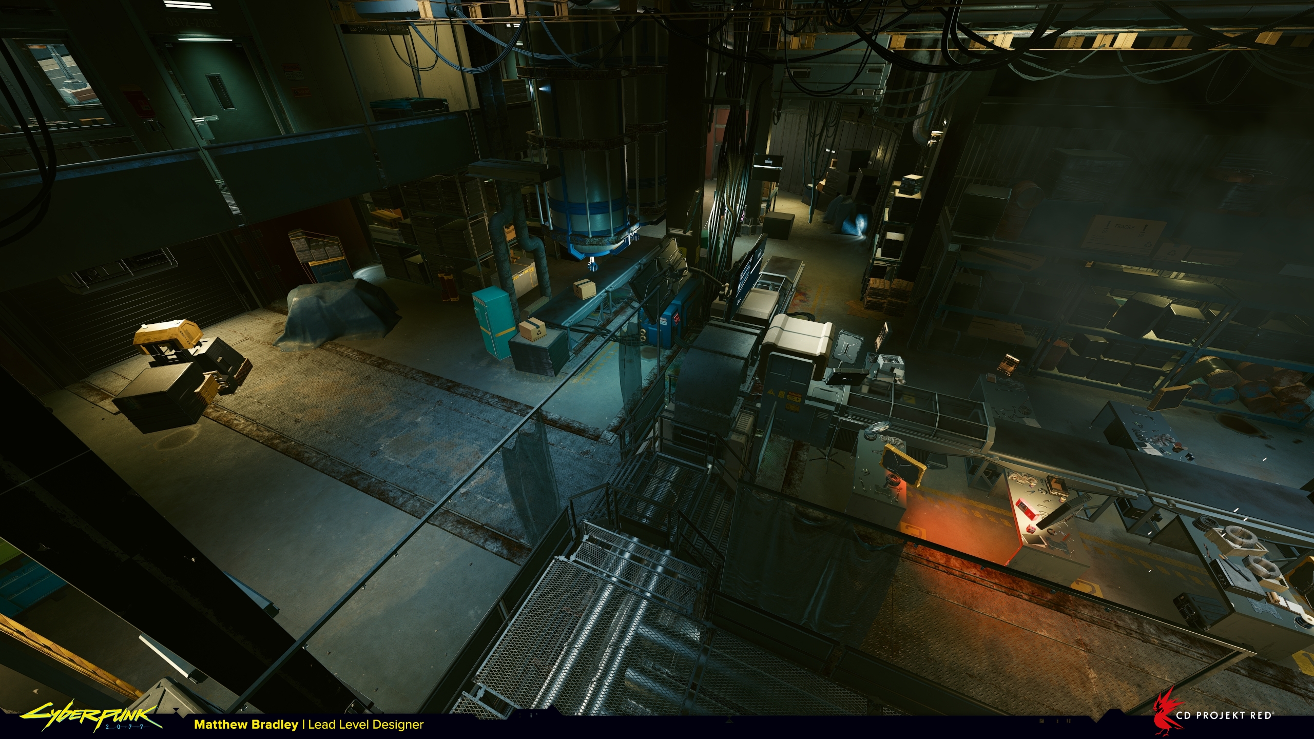
Kendachi Factory from ‘Race to the Top’
The request for this mission was to have the player engage in corporate espionage inside an appliance factory, and for budget reasons don’t make it too big. A quick google image search will show you that these kinds of buildings are anything but small!
At CD Projekt Red we went to great lengths to create believable spaces in Night City so they would feel grounded in reality and not be overly sci-fi. But if authenticity is important and we know that usually in real life these kind of factories are huge, why not mirror the reference? Well every single location takes time to build. There’s an entire team of different disciplines who contribute, and while it would be quick for me to make a big, ‘realistic’ level design blockout, doing so would significantly increase the amount of time needed later on from environment artists, lighting artists, quest designers, FX artists, etc.
Being overly-ambitious regarding scale is an easy trap to fall into as a designer. It’s important to remember that even if your design is the most magnificent thing in all creation, it isn’t very successful if it doesn’t meet the brief.
So how do you make it into something affordable, but also believable? There are a couple of options:
- 1. Go back to the quest/narrative designer and discuss changing the setting, or
- 2. Take the main recognisable elements of the setting and condense them into something more feasible.
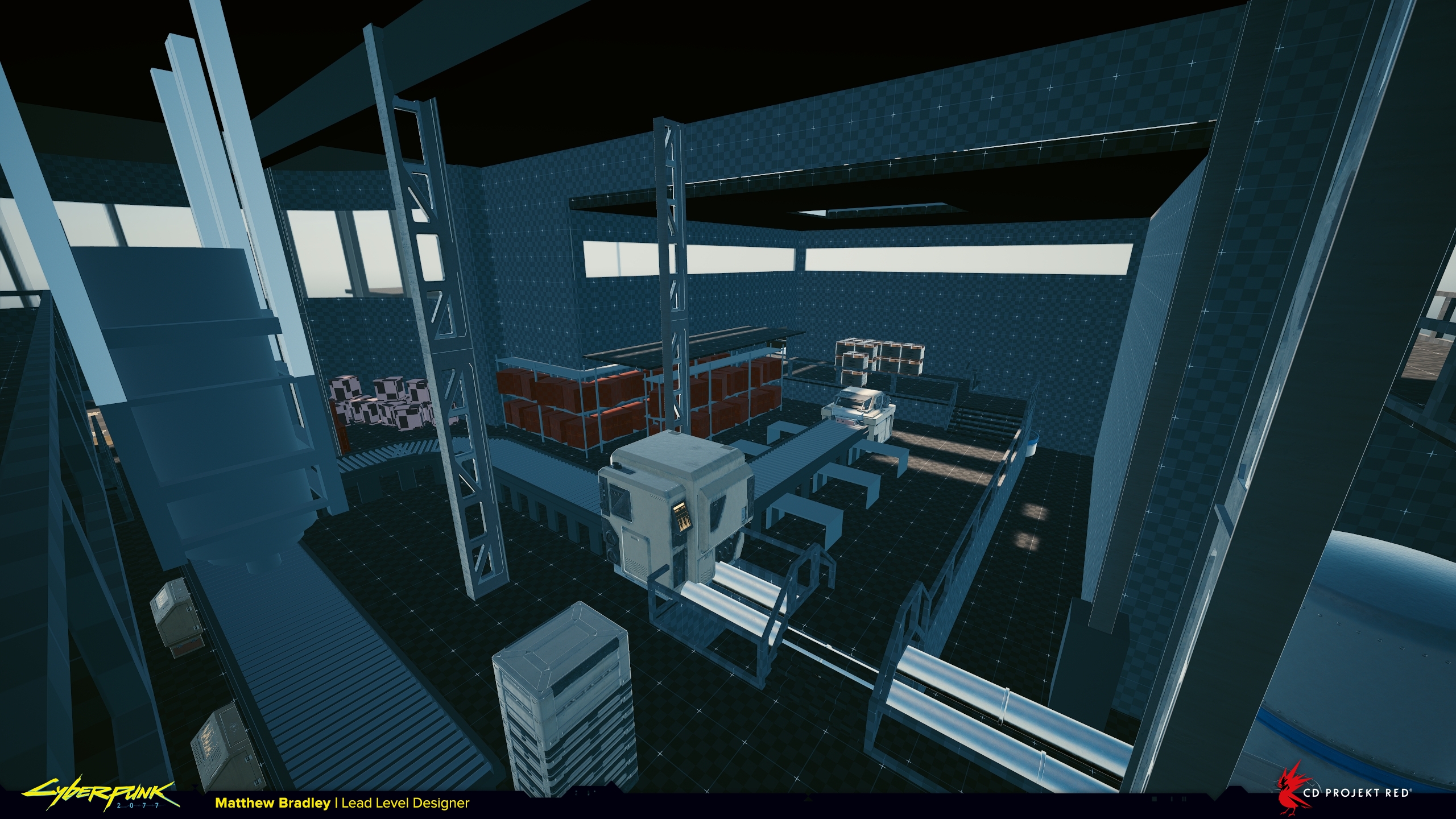
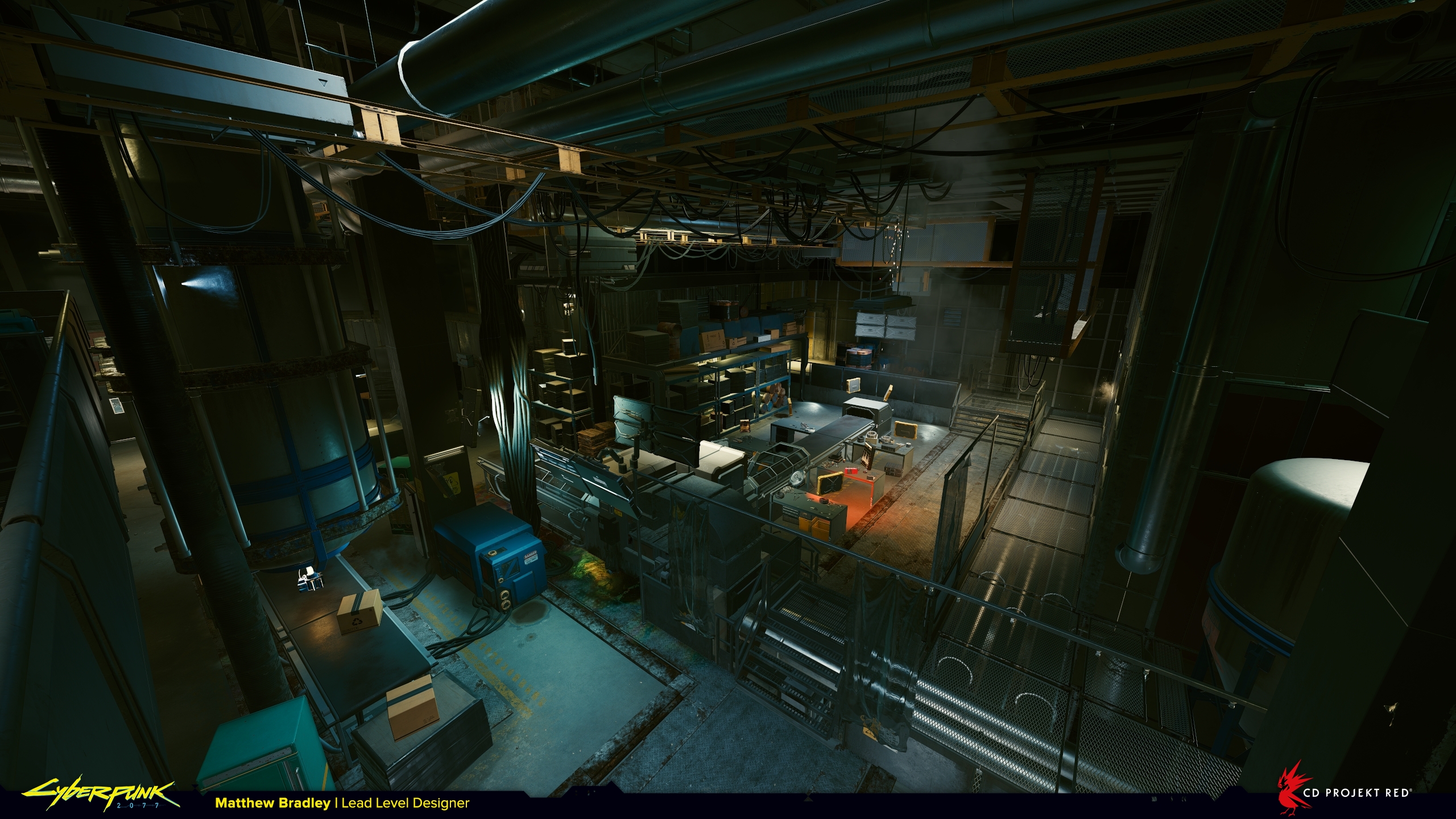
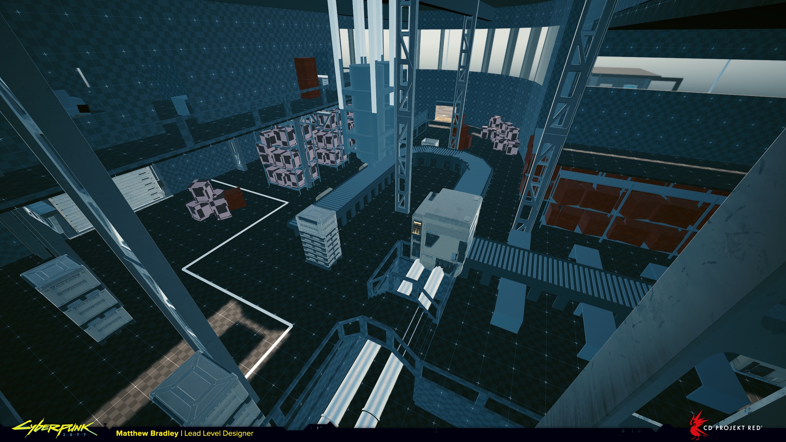
In this case I went for the second option and actually in the end what’s being manufactured here is pretty ambiguous. We don’t really see appliances getting made, but what we do see is enough to say something is getting made, and it roughly matches up to our general expectations. The goal is to fulfil the narrative fantasy, not necessarily create a completely accurate 1:1 version of an actual working factory. As long as the level has a decent foundation in real-life reference it’s enough.
On Cyberpunk 2077 the level design team were tasked with making so many warehouses and factories that it became a bit of a running joke. We tried our best to make them varied at least, so for this quest when I came across these amazing illustrations from the 1930’s of streamlined art-deco industrial and commercial architecture I was inspired.
There’s a quote from Bruce Mau I like very much when it comes to using reference:
“Imitate. Don’t be shy about it. Try to get as close as you can. You’ll never get all the way, and the separation might be truly remarkable.”
In every location, before building anything, I collect as many reference images as possible to form a mental vision of the space. Some are useful for the architecture, big features, composition and overall form, some for how the space itself functions, and some just have details I like or find interesting. It’s a bit like a painter loading up their palette with colours. Then when creating the space I’m taking bit’s and pieces from each and mixing them together to make something altogether new.
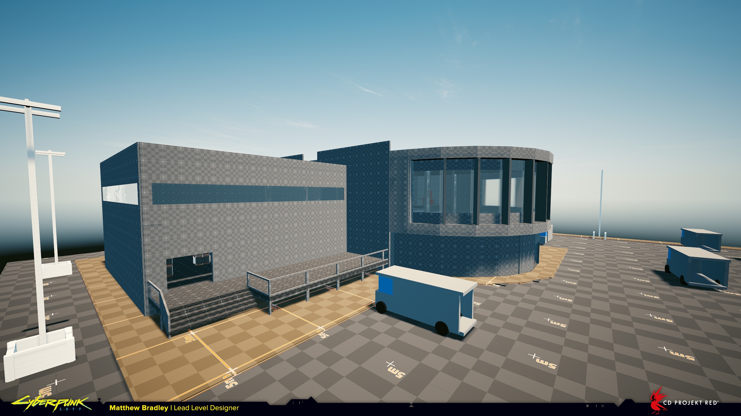
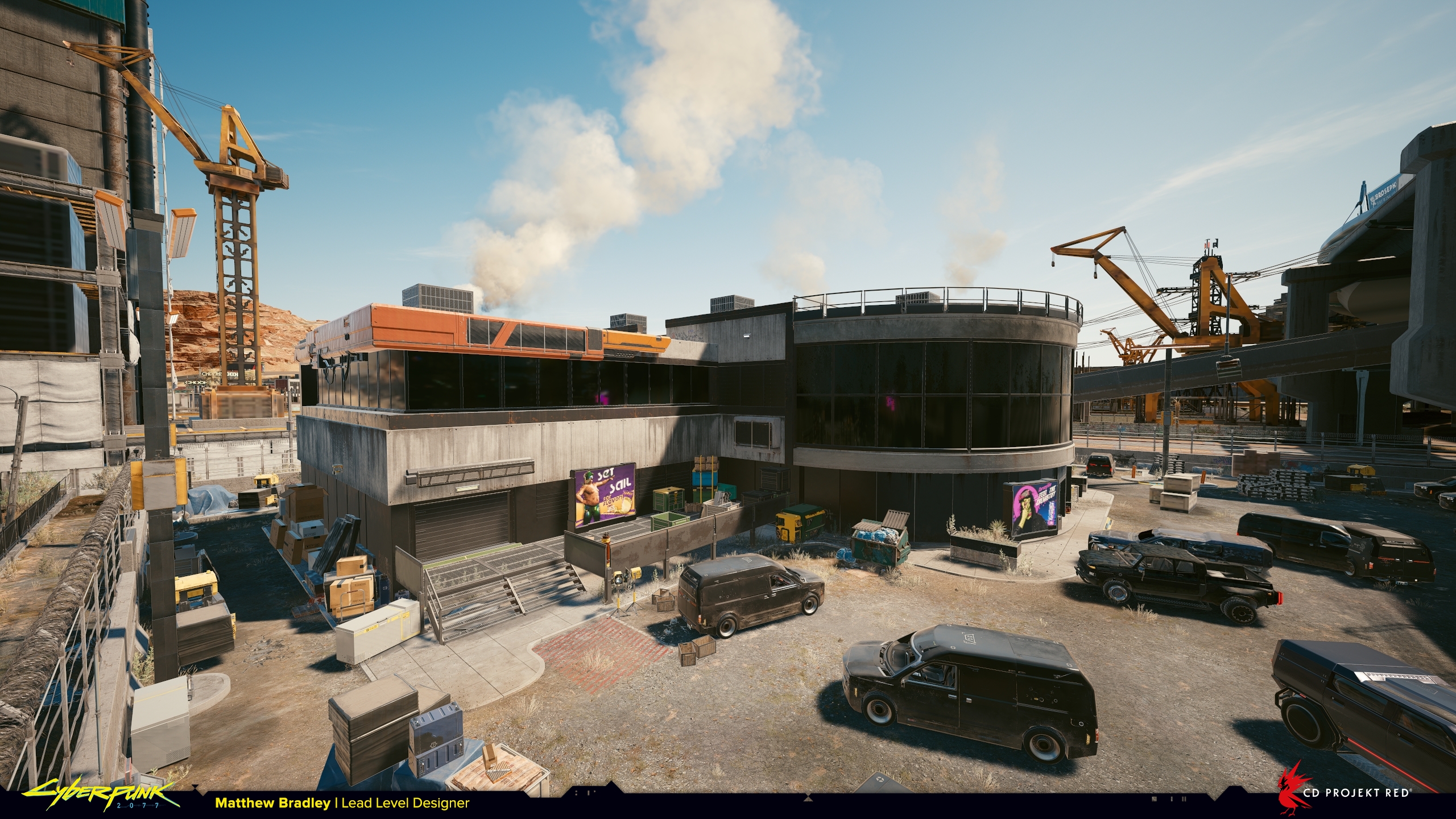
Above you can see three shots from roughly the same camera angle as the location progresses through different departments. First my level design blockout, then from that the concept artist (in this case the brilliantly talented Marthe Jonkers) takes a screenshot and directly paints-over it to establish the visual style and atmosphere, and finally the art and post teams do their magic based on the concept art.
6th Street warehouse from ‘Arroyo’
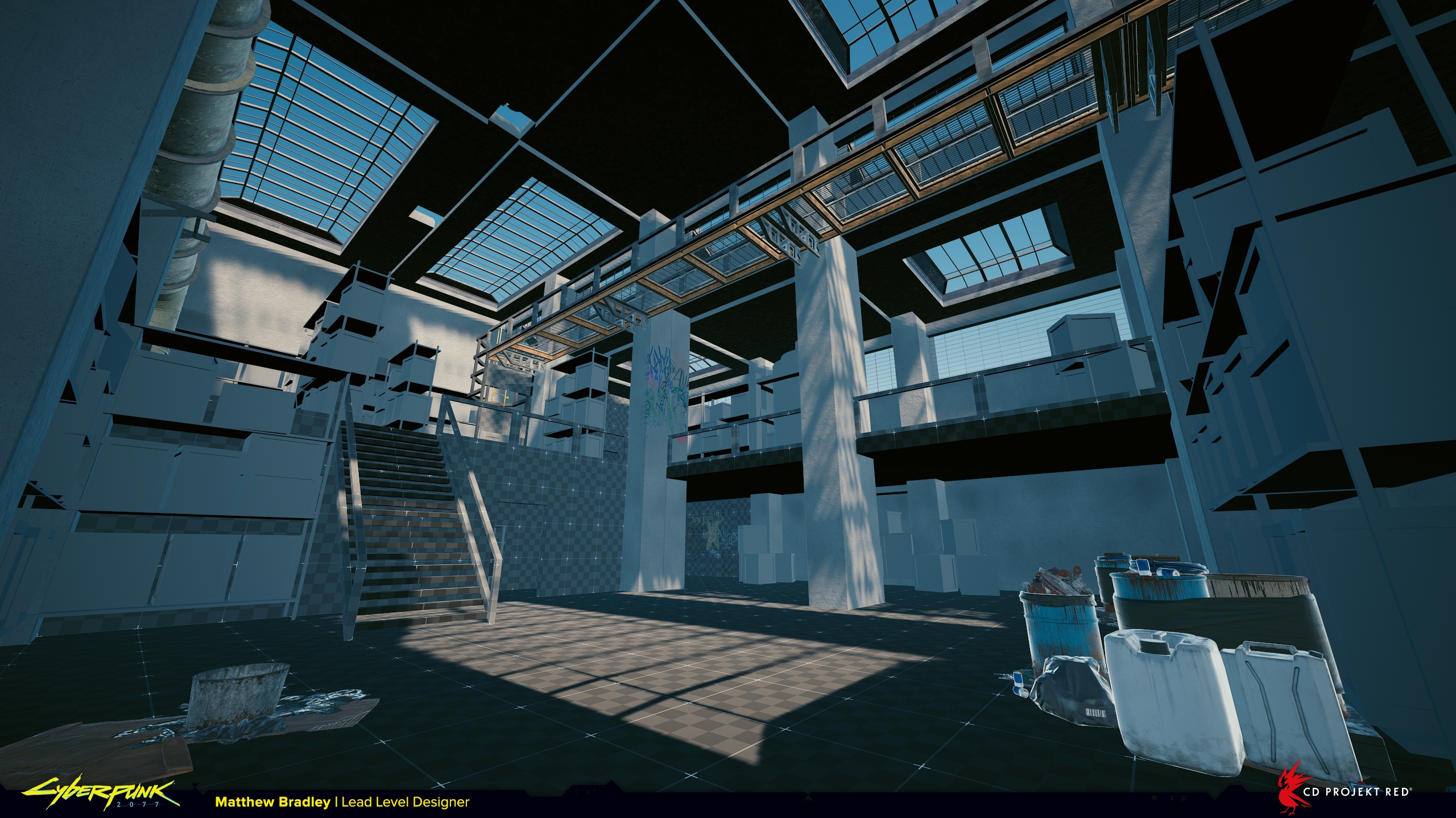
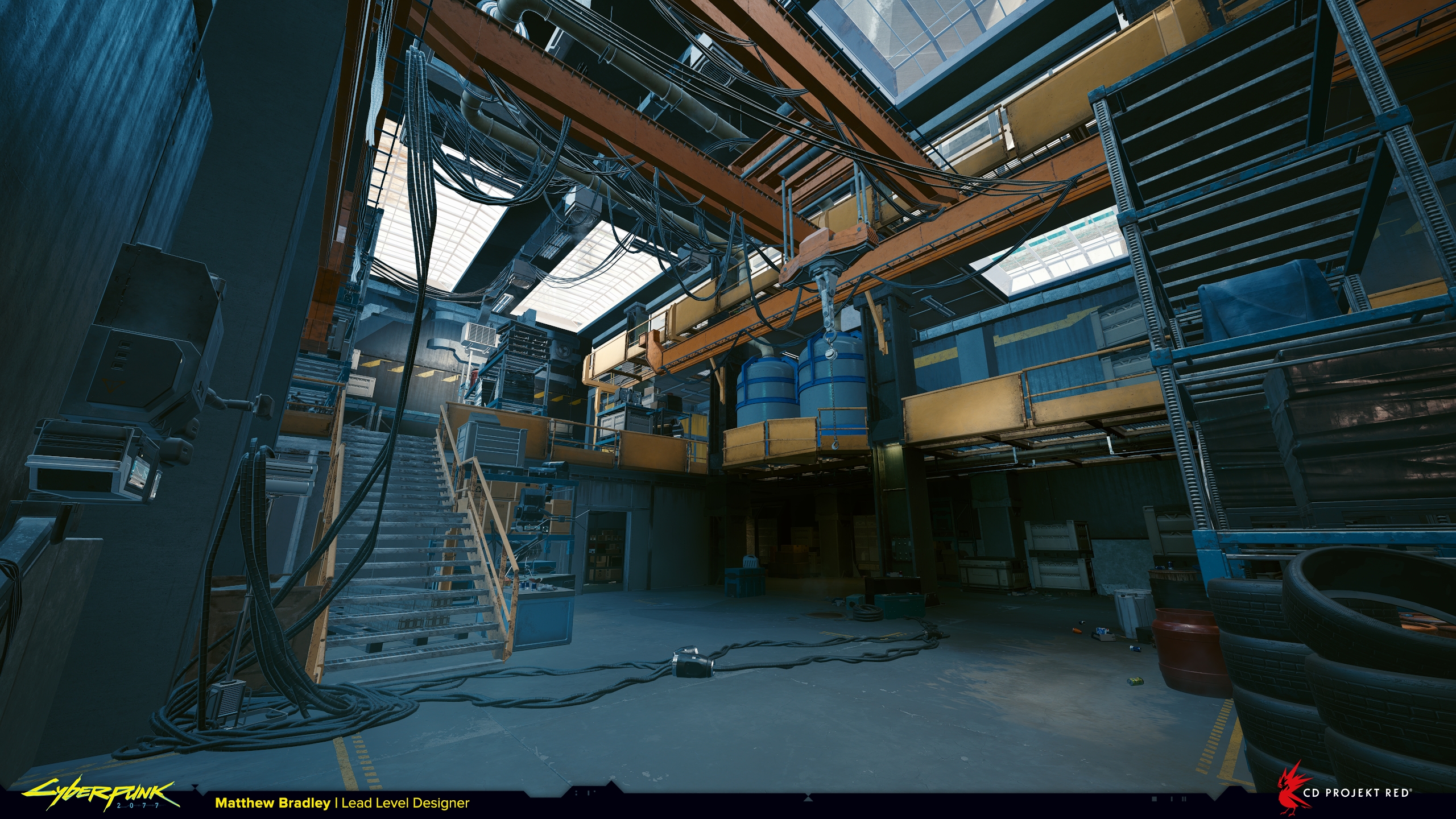
This one was made very quickly, I spent around a day on it. I’d like to believe that every next thing I make will be a slight improvement over the last thing, but that’s a really difficult position to take when you have next to no time to deliver something. Accepting that not everything will be a masterpiece is actually a necessary reality to getting things finished. As the old adage goes “perfect is the enemy of done“.
When you’re given a task like this with such a tight deadline the question to ask is: “how can I answer the design brief in the most efficient way?“. There’s not a lot of room to try things and fail. There’s pressure to nail it first time, and although I wanted this warehouse to feel different from others we’d built, there wasn’t really time to experiment. This is where experience and creativity come in handy.
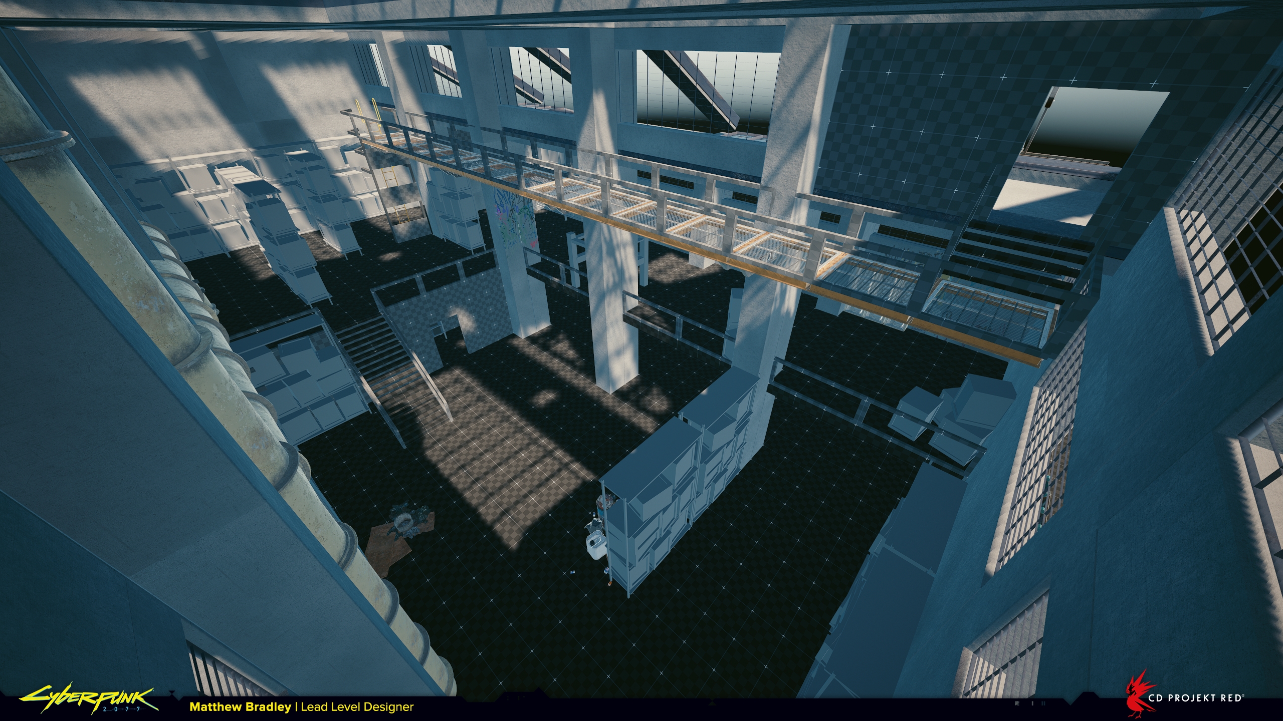
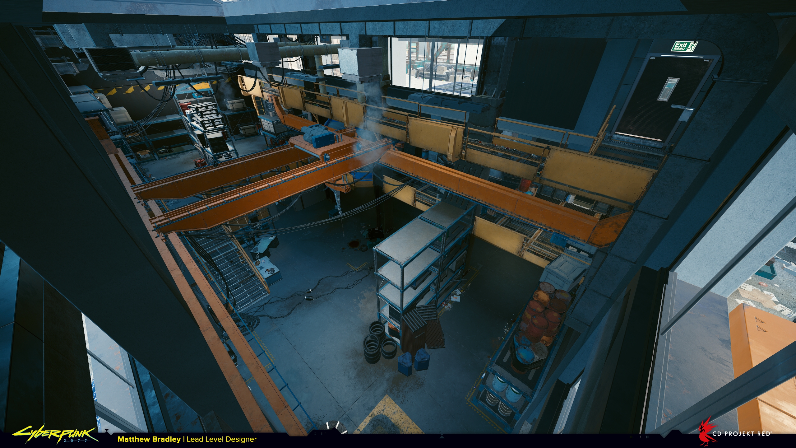
Here, I found an existing warehouse exterior we’d already made for another location, so I reused it in order to concentrate on the interior.
Regardless of how much time you have, keeping things simple is always a good approach. I decided to split the building into three floors because elevation is an easy way to add interest. If in doubt, add elevation! It doesn’t have to be huge differences in height, even just a metre here and there will improve the level. It’s so important to give players visual variety and show the environment from different angles. It emphasises they’re in 3d space rather than on a 2d plane, especially in first-person games where the camera height is fixed.
Apartment from ‘Bring Me the Head of Gustavo Orta’
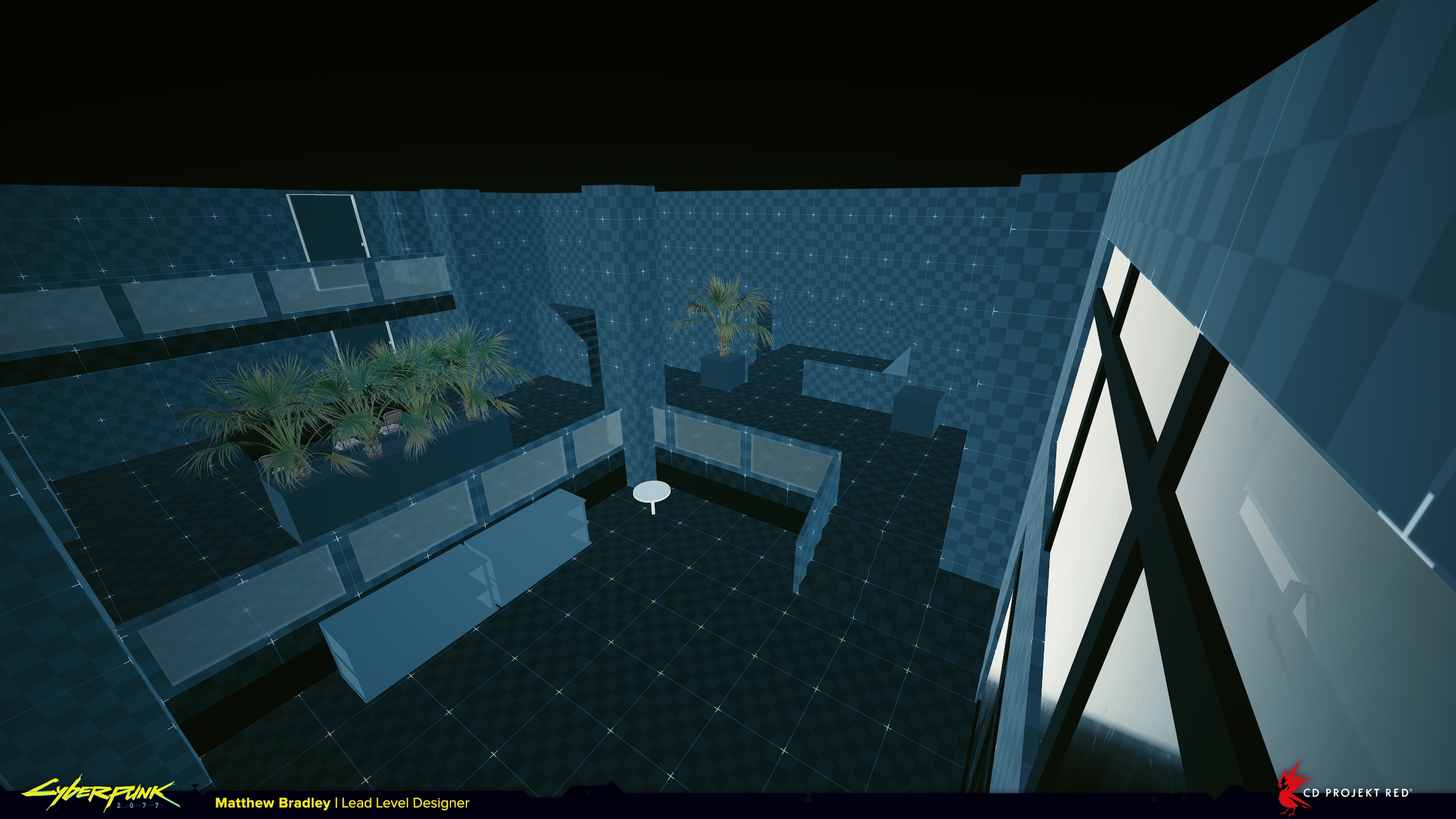
Notice how chunky and oversized everything is in this apartment, big columns, boxy planters, large furniture. In real life, it’s unlikely the building would have this structure. Nobody would build so many heavy, load-bearing columns through an apartment, especially one this expensive-looking.
So why design it like this? Why not try to keep it grounded in reality like before? Because in this mission we knew from the start that this space would feature a fight against multiple enemies, and that brings its own set of rules which directly influence the layout and composition of the level.
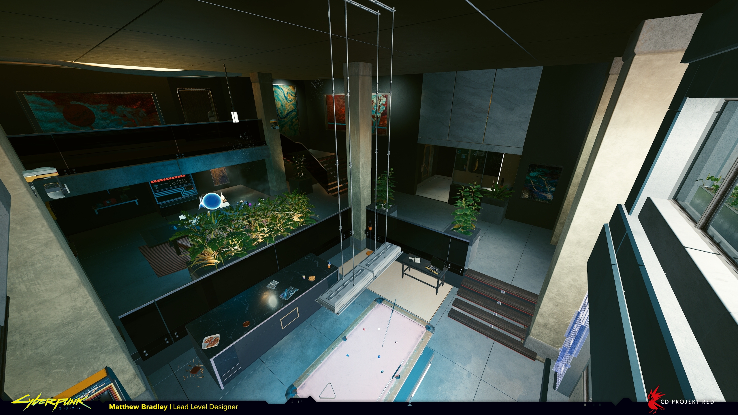
If you’ve ever done any kind of level design you’ll know a bit about metrics. For anyone who hasn’t; metrics are a set of measurements we follow when building levels that tell the player how to interpret the game-world.
They exist to make sure that mechanics are used as the game designer intended. For example; If the game designer creates a mechanic where the player can wall jump like Super Mario they might find that it works best if the distance between the walls is 2 metres. So that becomes our wall jump metric, and wherever we want to use that wall jump mechanic in the game, we always use the same 2 metre metric.
When used consistently they create a visual language that explains what opportunities (or affordances) are available in the level. Effectively it’s a way of communicating to the player how you want them to use the environment, and the clearer they are, the easier it is to understand how to play the game.
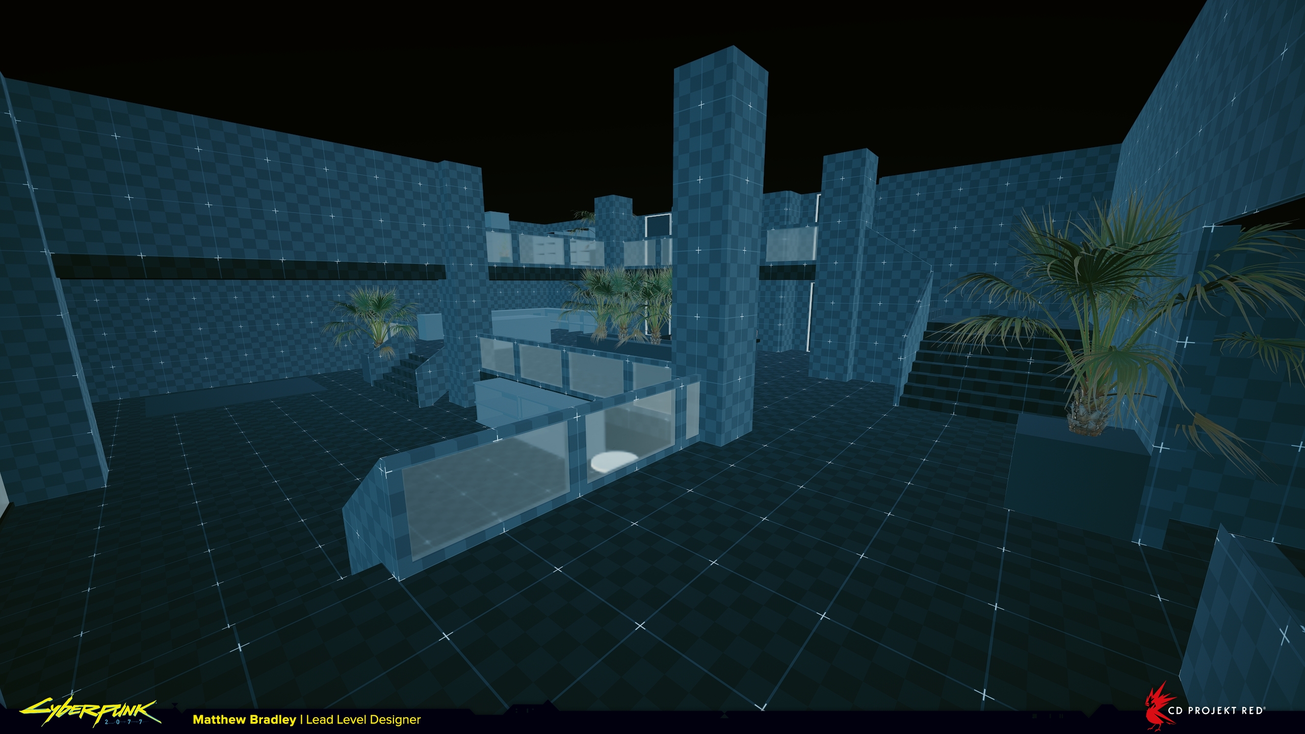
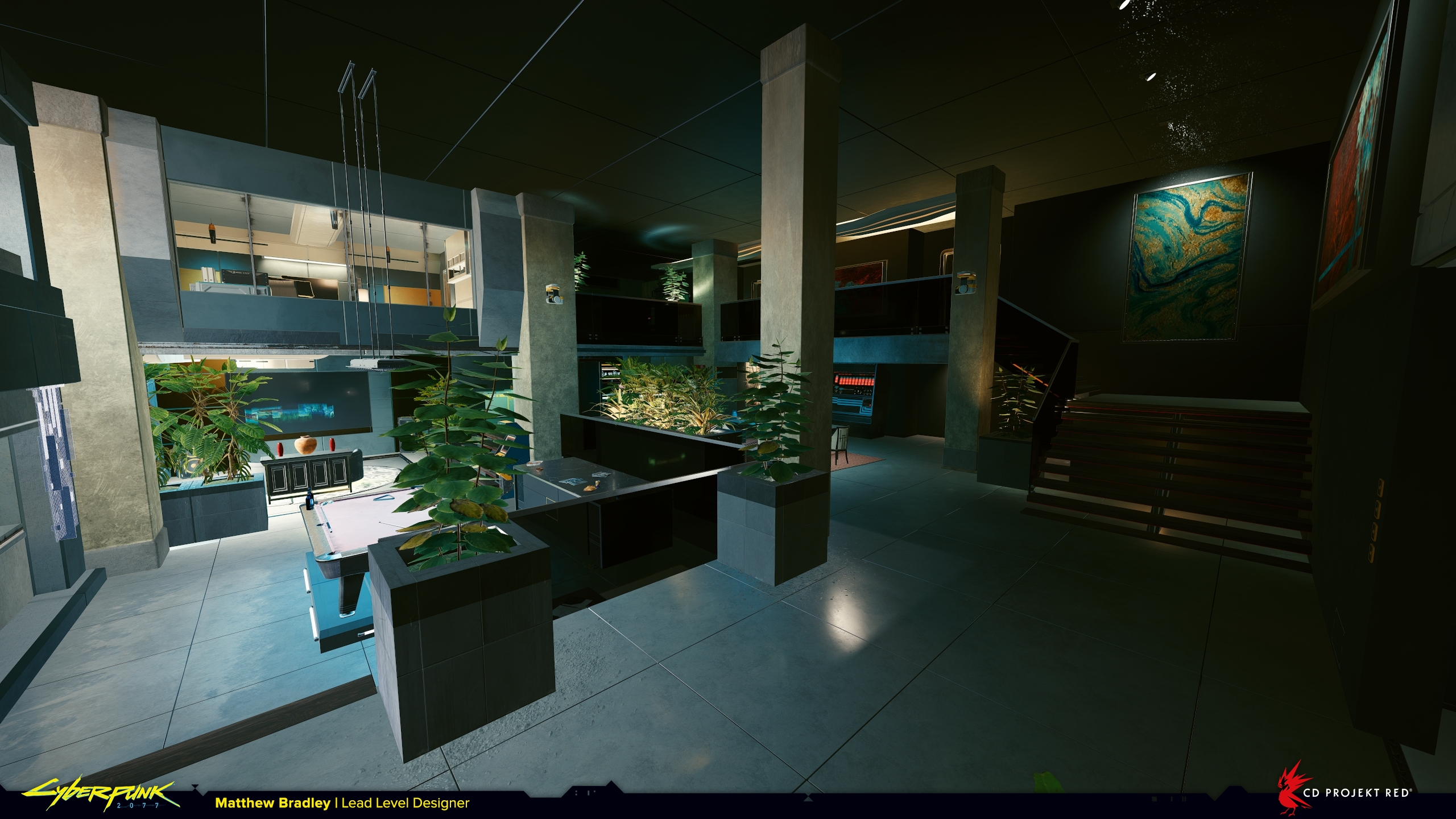
Even though in reality a fancy apartment like this would likely have more elegant, delicate shapes, here the columns, planters, and furniture are at least 1m tall and 1m wide. They have significant mass to make the player feel safe when hiding behind them. When you’re being shot at, clarity is vital to split-second decision-making, and so these shapes are designed to be easy to identify quickly.
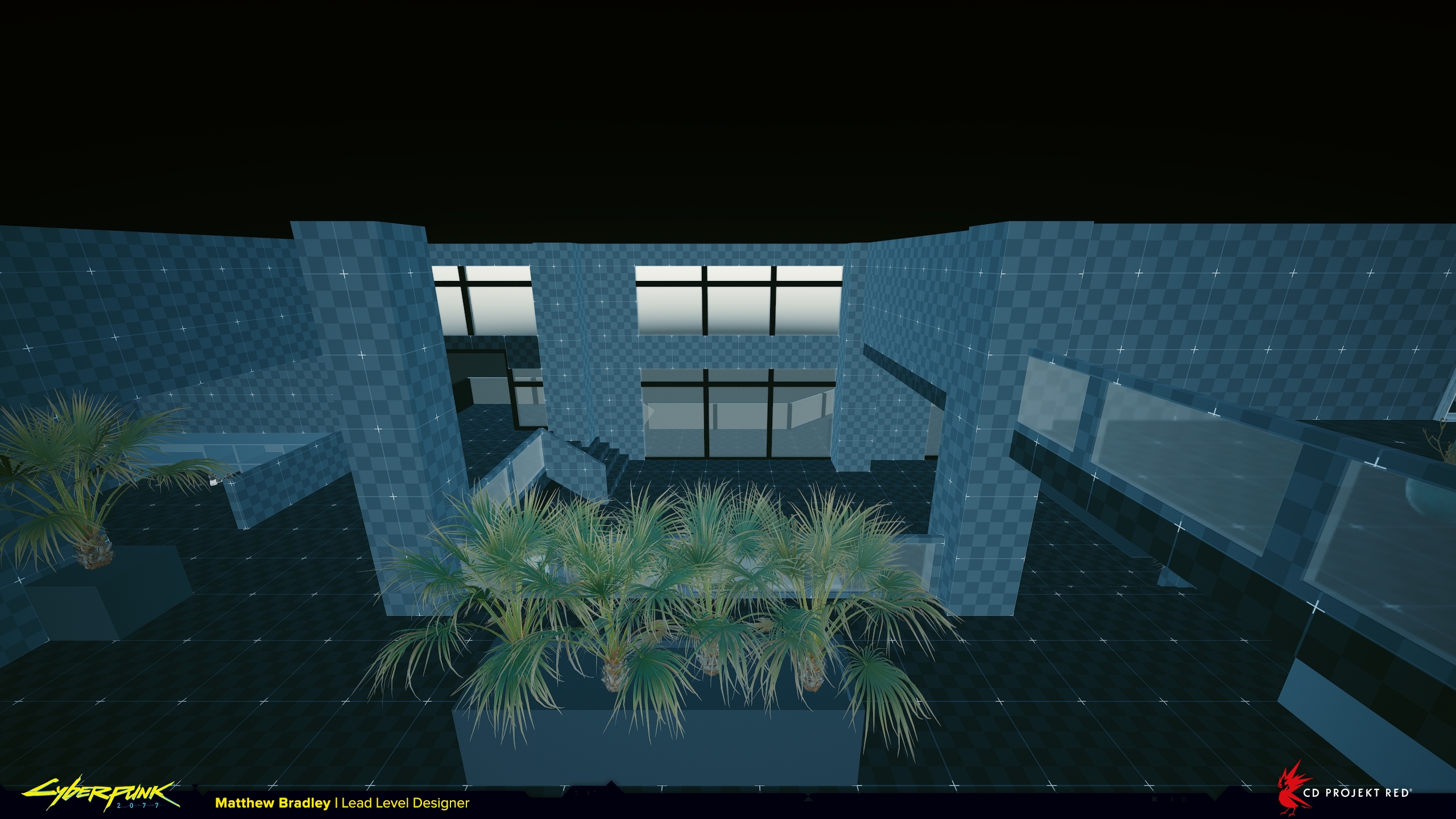
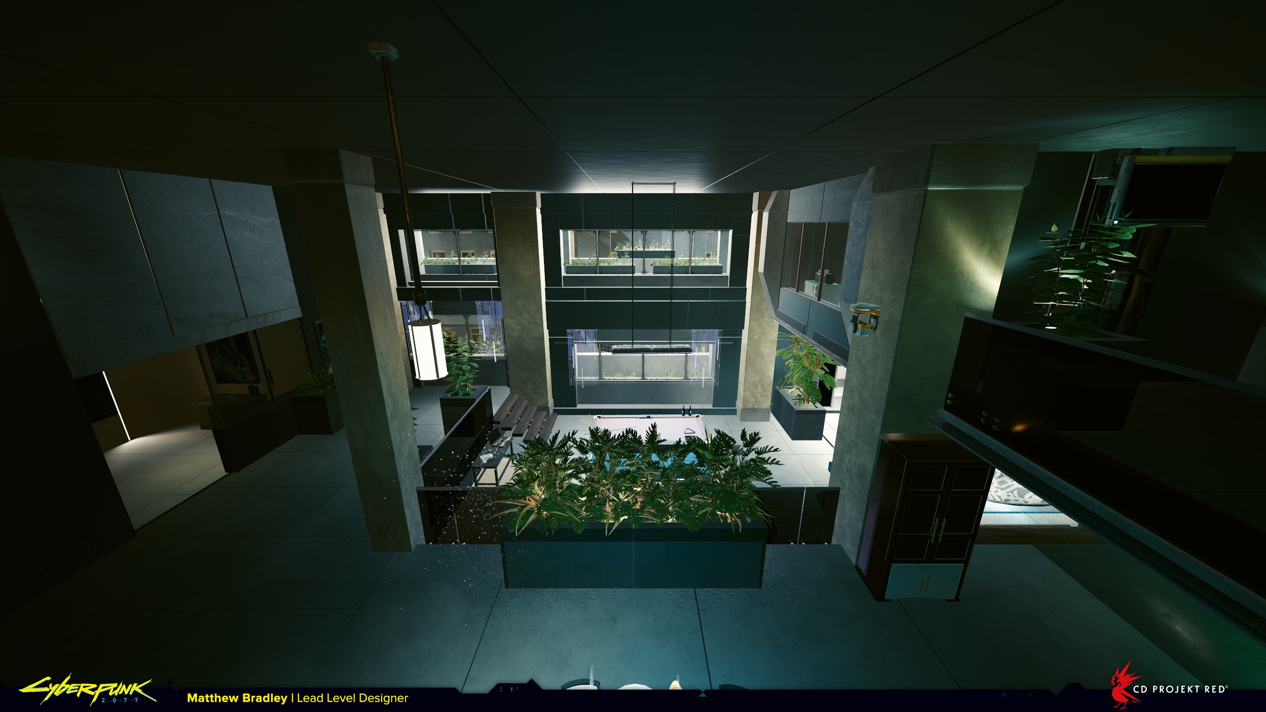
With all that in mind here you can see I’m trying to set up combat in a certain way with this layout. In the above slider the player enters from the left, and enemies start from the right. The void in the middle creates distance and clear lines of combat that give the player engagement options. They can flank left or right, take high ground on the balcony, or, if they are aggressive, push forwards taking the low ground, though this is not as common because it’s the weakest combat position and we subconsciously avoid it.
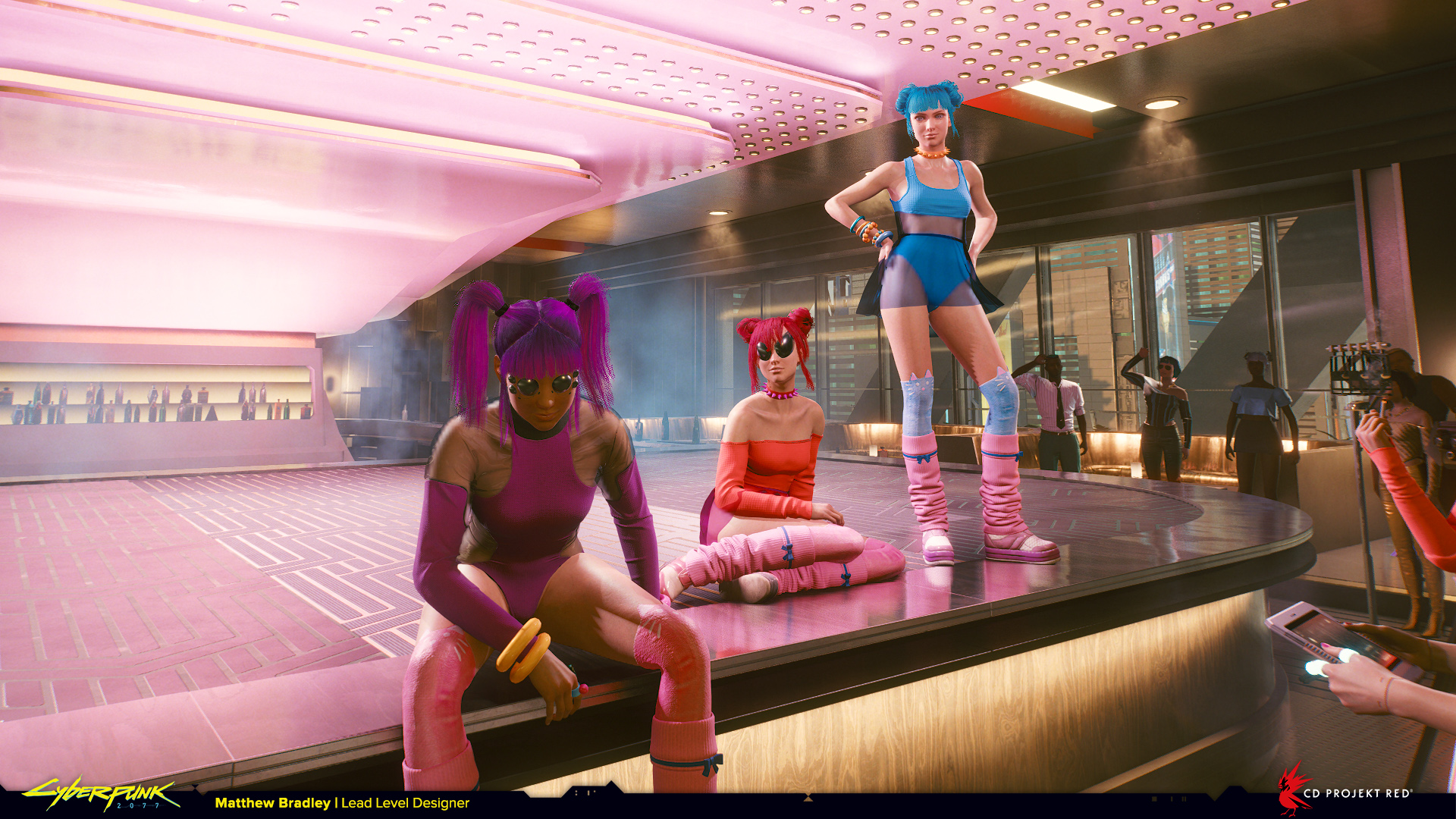
Captain Caliente, Riot Nightclub, and Dark Matter from ‘Rebel! Rebel!’, ‘I Don’t Wanna Hear it’, and ‘Off the Leash’
Level design on these story-quests is much more about pacing and atmosphere than in gameplay locations. We’re thinking about where the scenes will be, where the characters will be, how much space there is for V and her companions, how the player will physically move within the space, and what kind of vistas we can set up to be enjoyed during some of the longer dialogue sections.
As an additional layer some locations reflect the narrative emotion through the architecture. For example, if the story wants the player to feel oppressed then the setting itself can be oppressive too. Corpo Plaza is a good example of this in Night City. There, the buildings and infrastructure are so vast it makes the player feel small and insignificant.
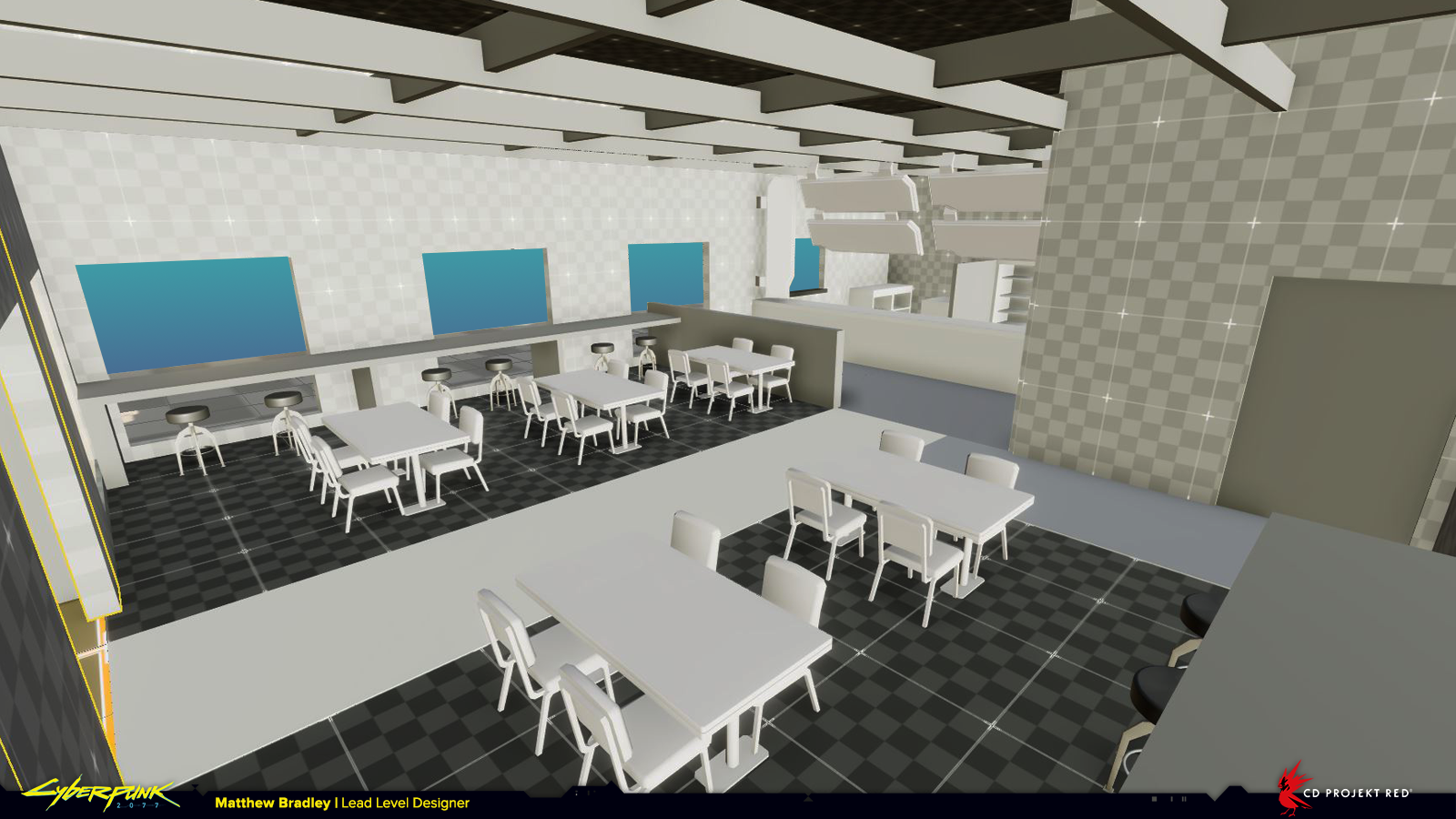
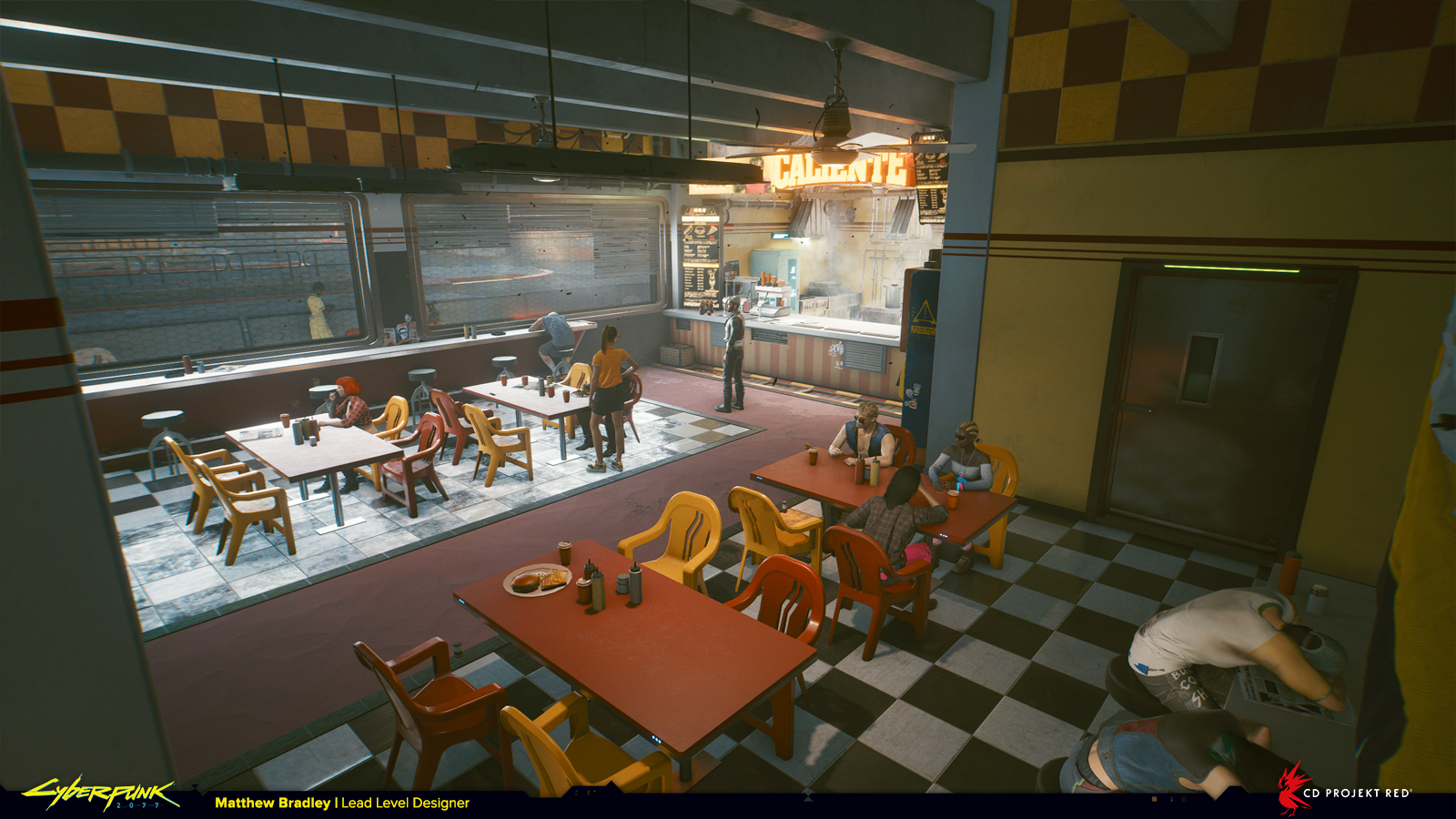
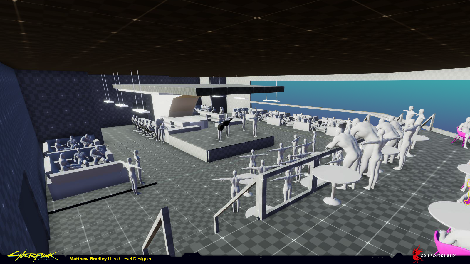
In this quest featuring Kerry Eurodyne and Us Cracks, you can see how much more detail there is in the blockout. We’re going further than in other locations so we can get a better feel for the quest early on in development.
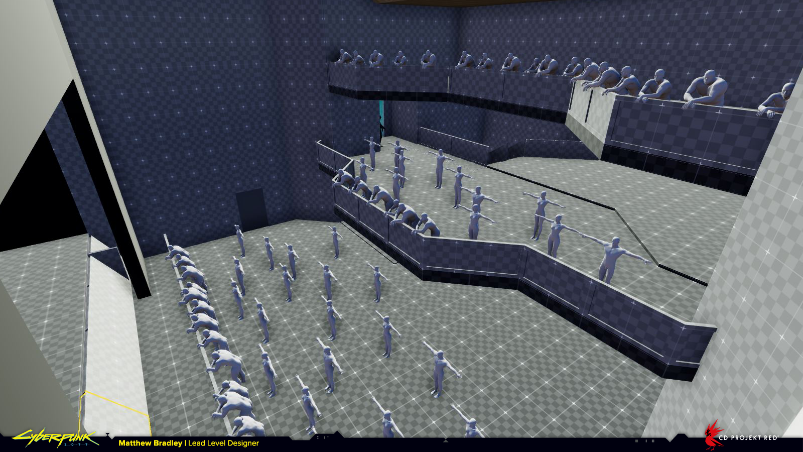
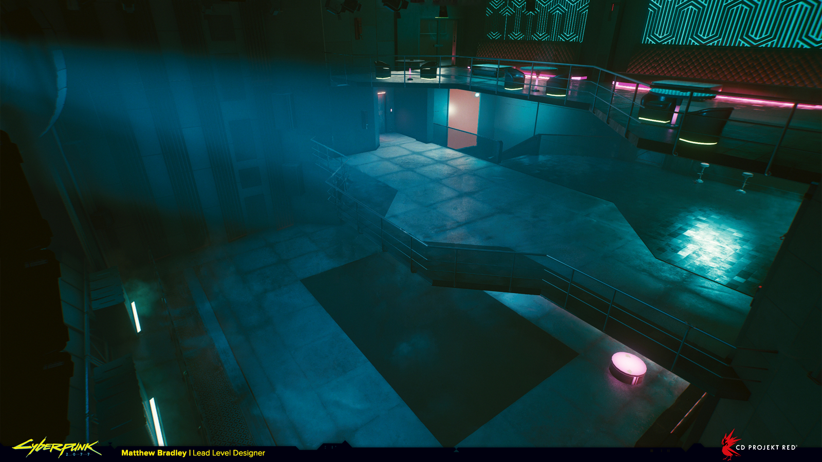
I know the human figures here don’t look great, but they’re a useful tool to quickly sell the concept of a packed club. During the blockout phase we’re really trying to express ideas in the most simple form so we can tell if they work or not before investing more resources.
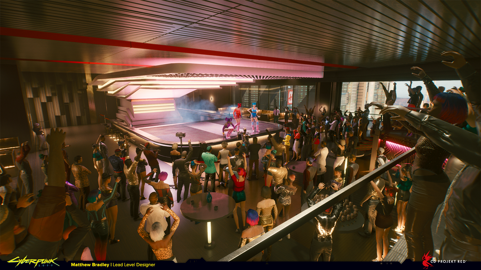
These locations were completed with amazing environment art from Simon Besombes and Albertus Januardy.
And so the end of part 2! If you made it this far thanks, I hope you enjoyed it! There are a couple more things still to share from Cyberpunk 2077, so follow me on Twitter to stay up to date with new stuff. Next time I’m going to change up the format and do a video breakdown of one (or more) locations in detail. In the meantime if you want to ask some questions or share some thoughts you can find me on Discord.
Cheers,
Matt


