Back in June this year I made the difficult decision to call time on three-and-a-half years at CD Projekt Red where I worked as lead level designer on Cyberpunk 2077.
In my final week before leaving I grabbed a treasure-trove of screenshots featuring some of the work I’d done for the game, much of it early level design blockouts for locations in Night City. Originally I’d taken them to fill the somewhat sparse Cyberpunk page on my portfolio, but over the summer I spent a lot of time thinking about game development and level design and figured out a more interesting use for them…
This feels obvious now, but as I’ve been away from the studio I’ve realised I really love making things. And one of the things I love to make the most is levels for video games. There’s magic and mastery in understanding how spaces make people behave, how shapes and forms communicate ideas and intentions. It’s a balance of theory and feel, of science and emotion.
It occurs to me that the power and value of level design as a discipline isn’t widely understood both inside and outside the industry. There’s so much still to explore! So I decided to set up this online presence to highlight its role in games through both theory and practice, while also aiming to share some lesser-known insider insights on the industry. And it just so happens that it’s also #Blocktober, the perfect opportunity to get started.
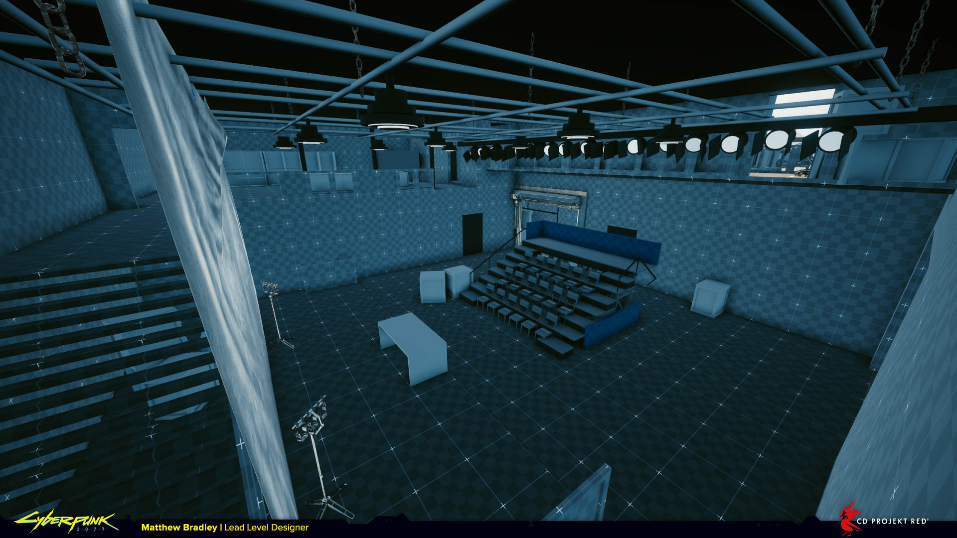
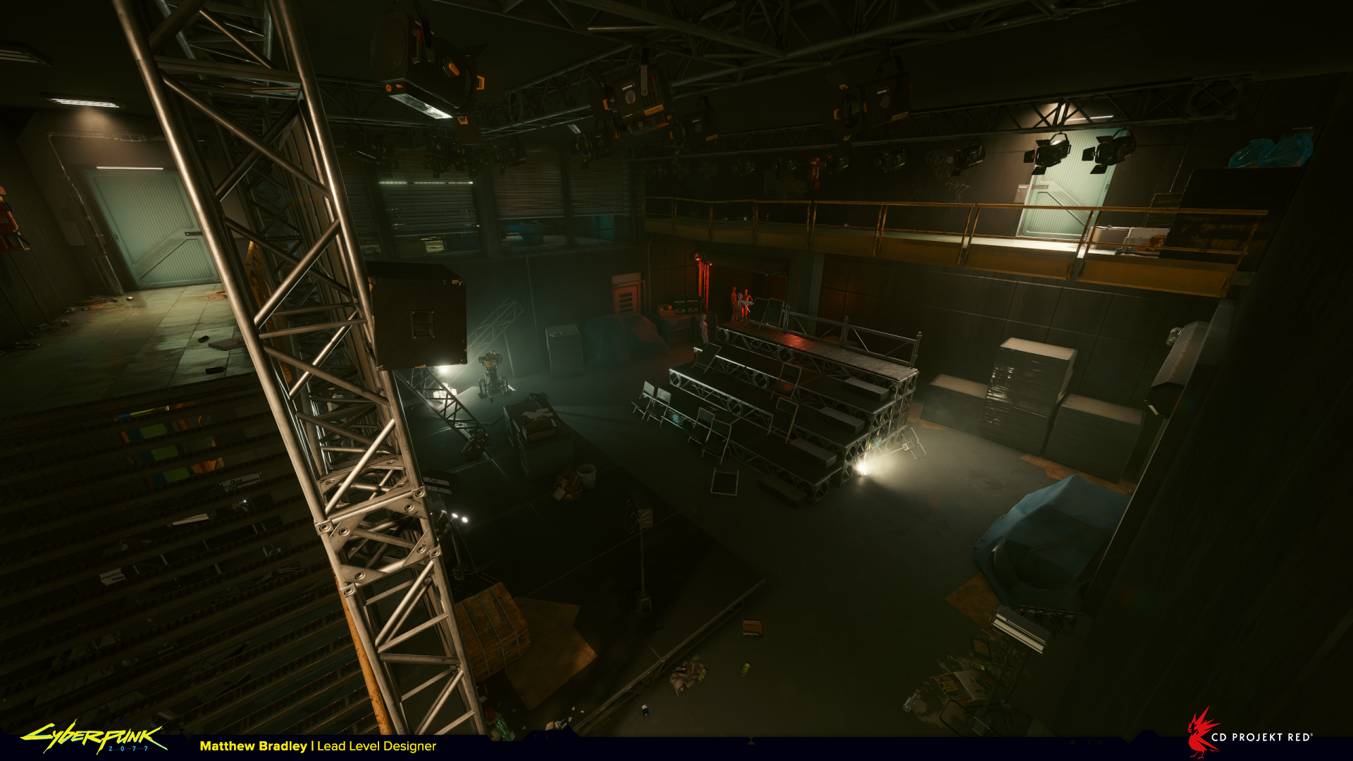
Possibly the most enjoyable thing about working in games as a level designer is seeing your ideas take shape, becoming bigger and better thanks to the skill and craft of artists who turn it into something ‘real’. With that in mind I’ve prepared a collection of before and after shots of locations from Cyberpunk 2077 to celebrate the process of designing and building environments from start to finish. What you’re seeing here is my blockout on the left and the final released in-game version on the right.
There are too many screenshots for a single post, so I’ll be dropping more parts over the coming weeks.
Enjoy!
Red Queen’s Race from ‘I Fought the Law’
Credit to Max Pears, Timur Ozdoev, Patrick Mills and the rest of the team for their work on this location. Max was responsible for the level and encounter post-blockout, Timur for the environment art, and Patrick for the quest and story implementation.
The Red Queen’s Race is a hidden bar for select rich and influential citizens of Night City. The entrance to it is hidden inside a container in a warehouse above. Think futuristic speak-easy. The player finds themselves here after a gang of Animals broke in and trashed the place.
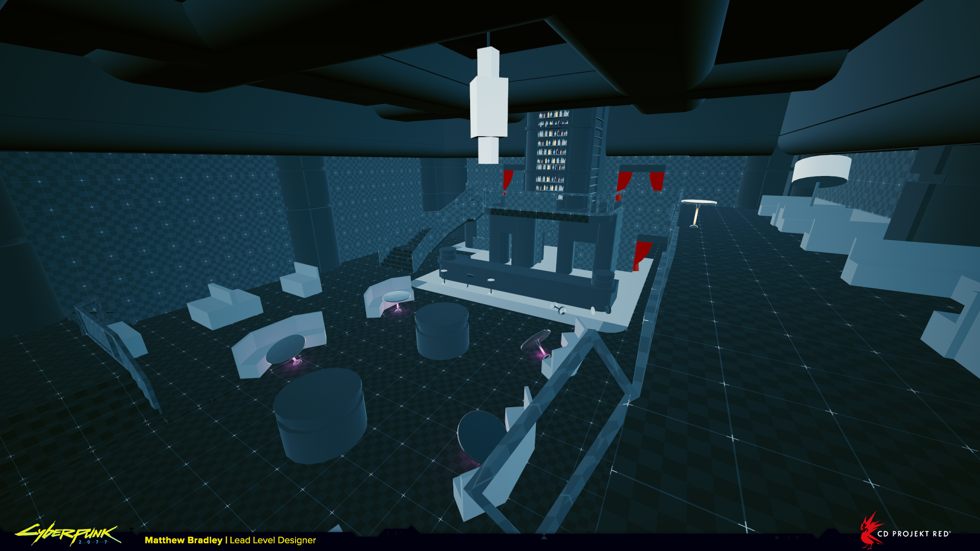
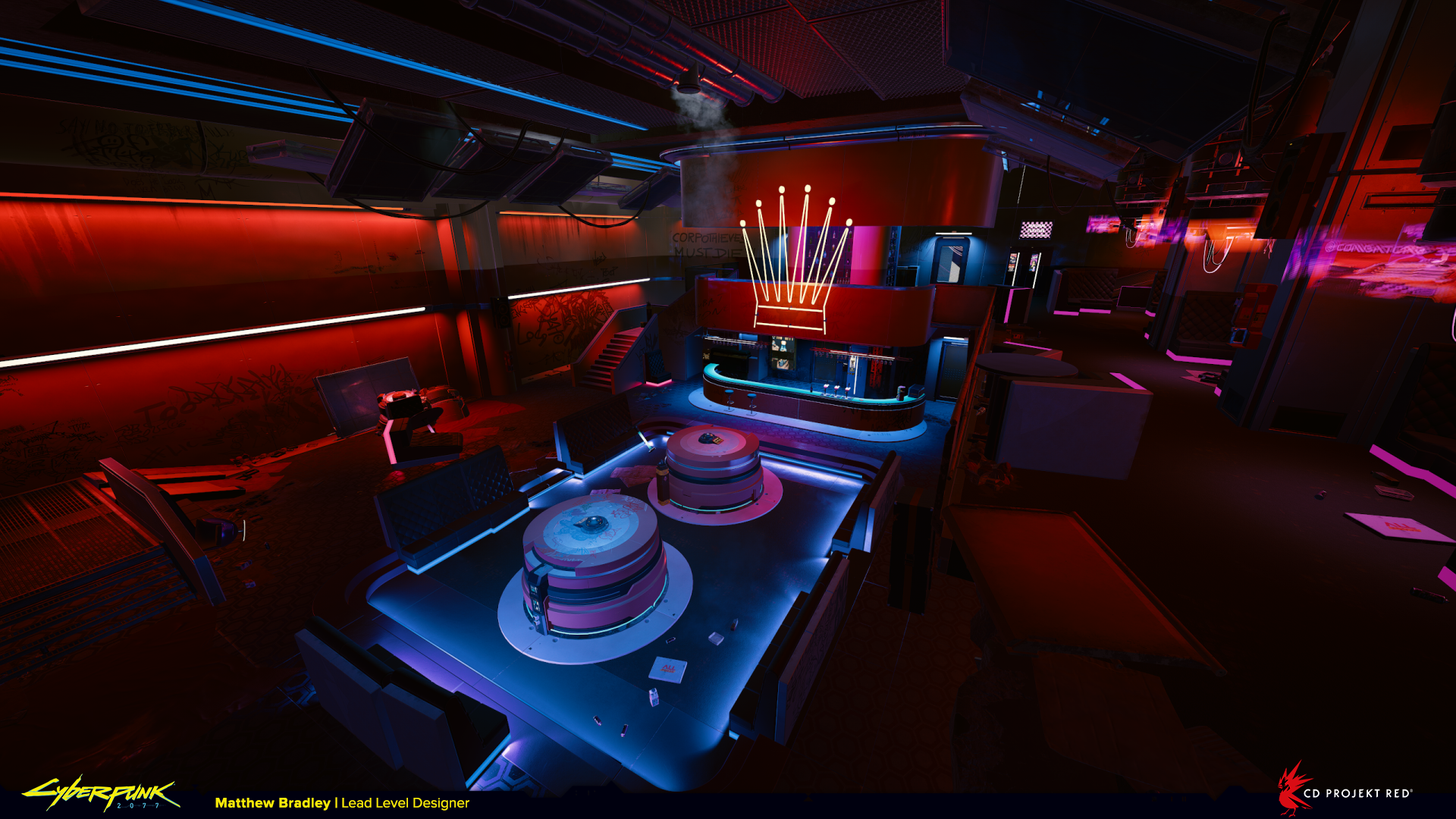
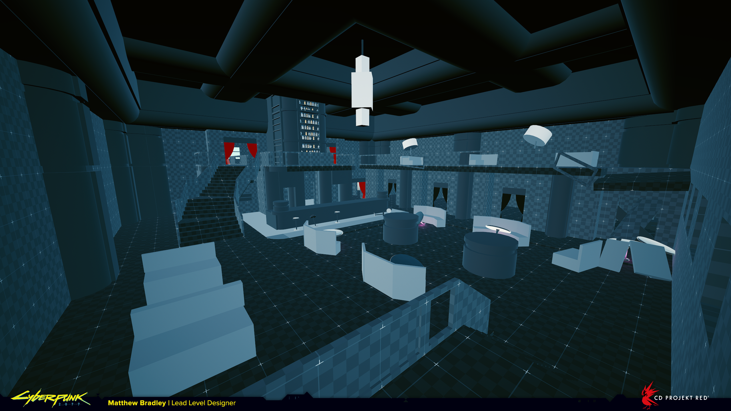
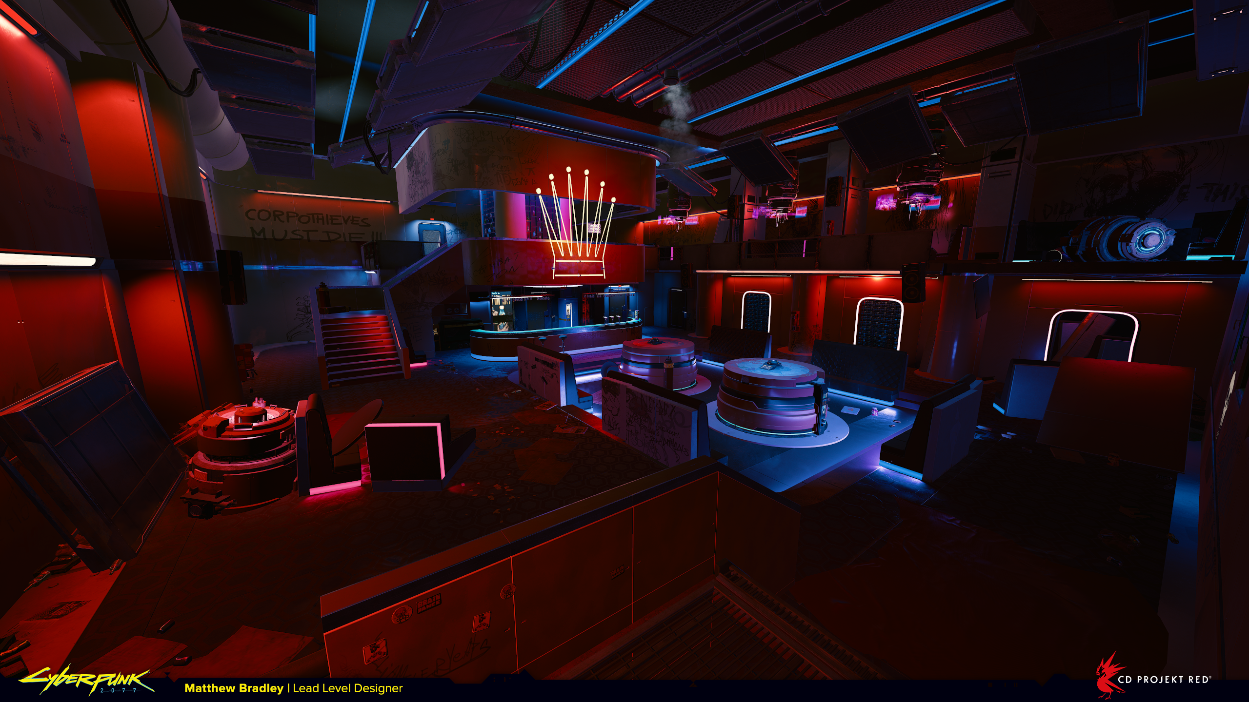
The first thing that stands out is how transformative lighting is. The white highlights around the doors on the right draw the attention, where actually the players’ goal is the doors lit in blue at the far end of the room. The contrast between white and red is stronger than blue and red in this example. It shows how important it is for navigation to get the lighting right. In the blockout you can see the ‘goal’ doors actually have red curtains to draw the eye. Sometimes details like this are lost over the course of development as other considerations take precedence. In this case putting the red in Red Queen’s Race.
Here’s the warehouse. Finding the balance between visuals, gameplay props for combat, and visual clarity is a real challenge. The final layout is pretty noisy from this camera perspective once these details are added.
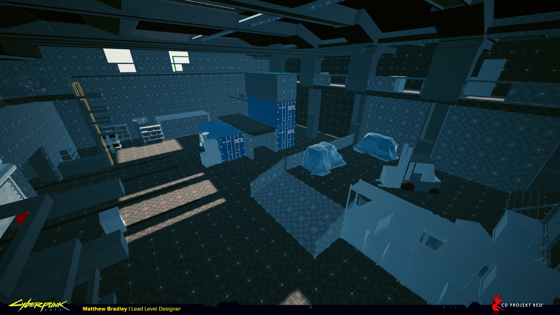
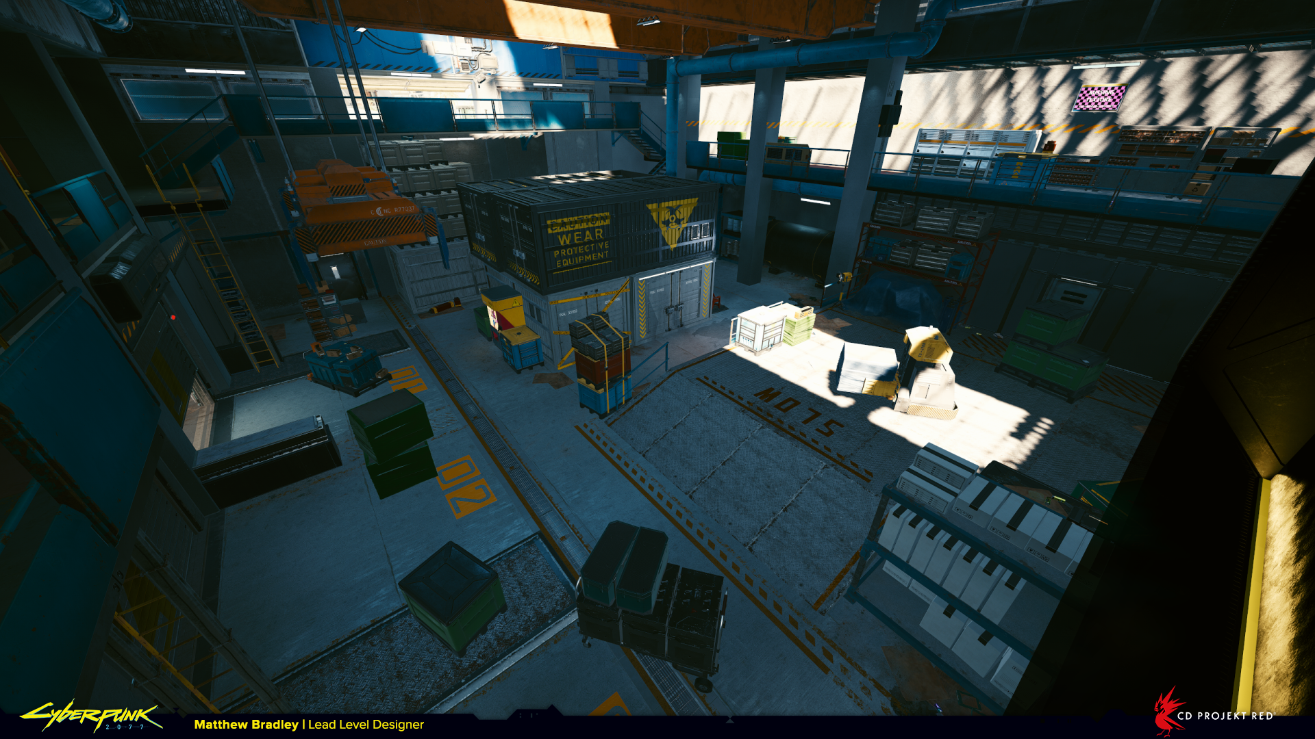
You can also see our beautiful level design kit-bashed version of a forklift on the right-hand-side. We use a lot of simplistic props like this to sell the concept and feel of a location before using proper art assets. By this point the blockout has been through a few reviews and as we’re more sure of how the space will work additional detail is added. This is something I notice being specific to CDPR, many other development approaches see much less stuff in the blockout.
Dewdrop Inn Motel from ‘Serious Side Effects’
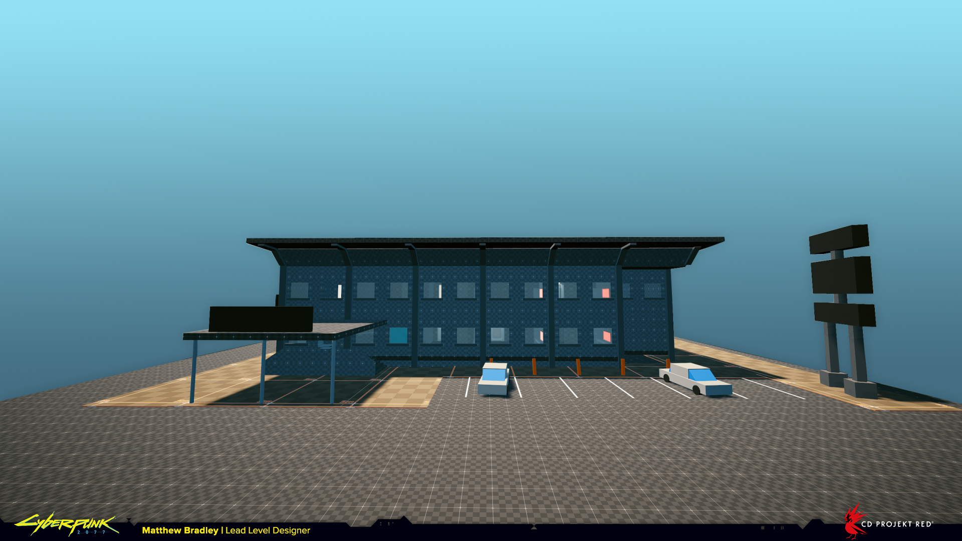
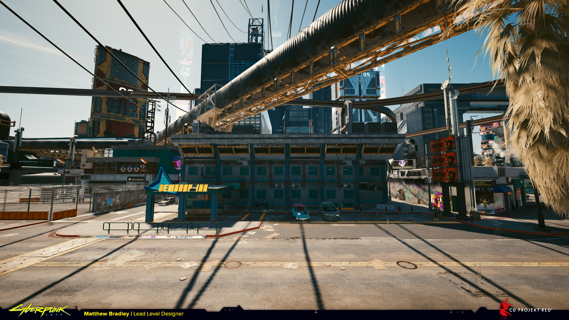
This level was completed in just a single day and you’ll notice it’s remarkably similar from blockout to final, which is surprisingly not the case very often. The environment art here was outsourced to Treehouse Ninjas in Hungary who were exceptionally faithful to the original layout. Thanks guys!
The two sliders below are a great example of how the sketch becomes something else entirely with art assets in place of checkerboard-textured boxes. As a level designer communicating your intentions through simple forms is a huge challenge. It takes lots of discussion and leaps of imagination to get to a shared vision with the artist. It often happens that a designer puts function (gameplay) over form (aesthetics), and leans heavily on the artist to try and make sense of the blockout.
In my experience the best designers consider both gameplay and aesthetics by giving context to what they create, not only because it makes the level more believable and cohesive, but because it makes everything that much easier later in development for other members of the team who come to work on it.
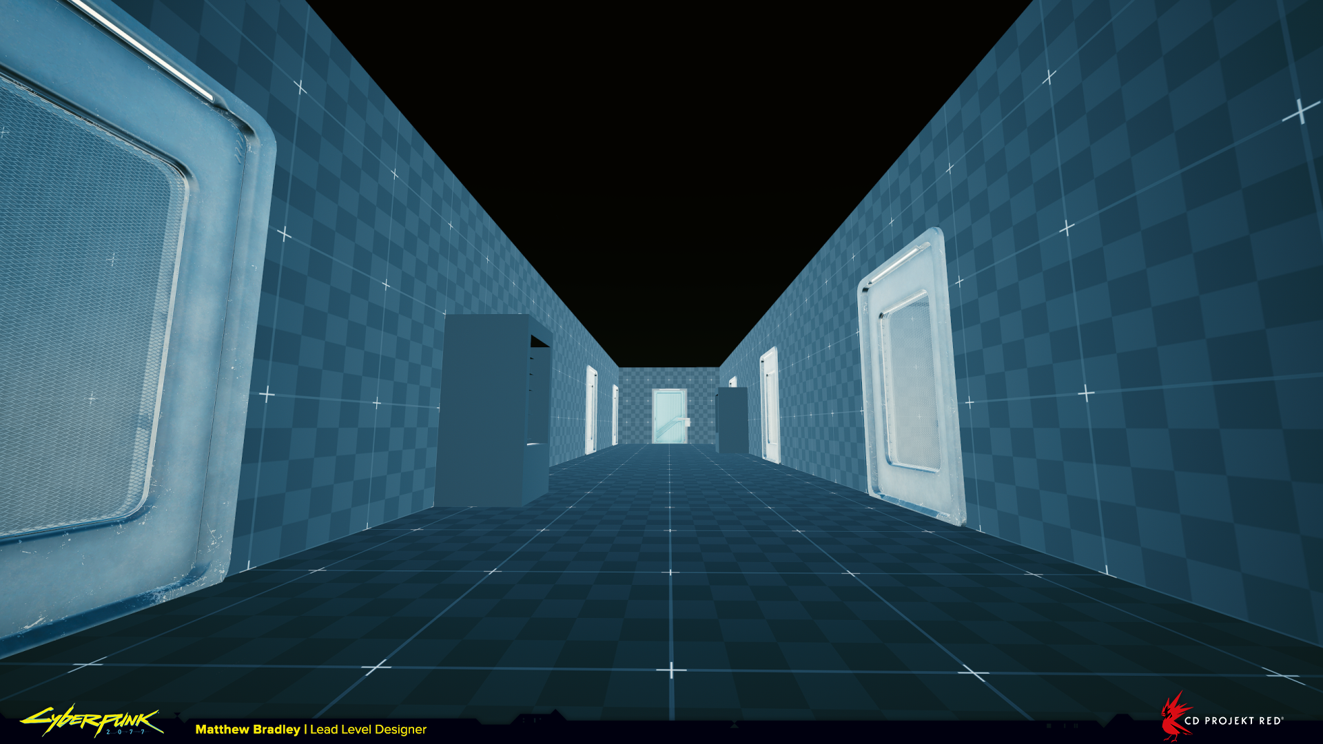
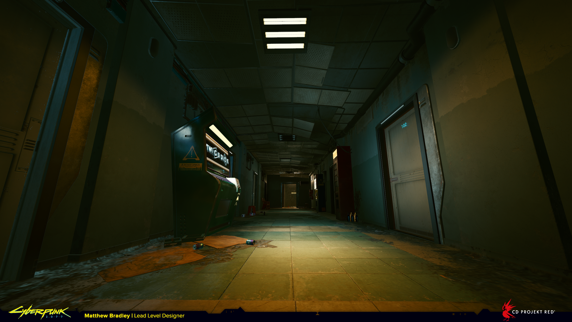
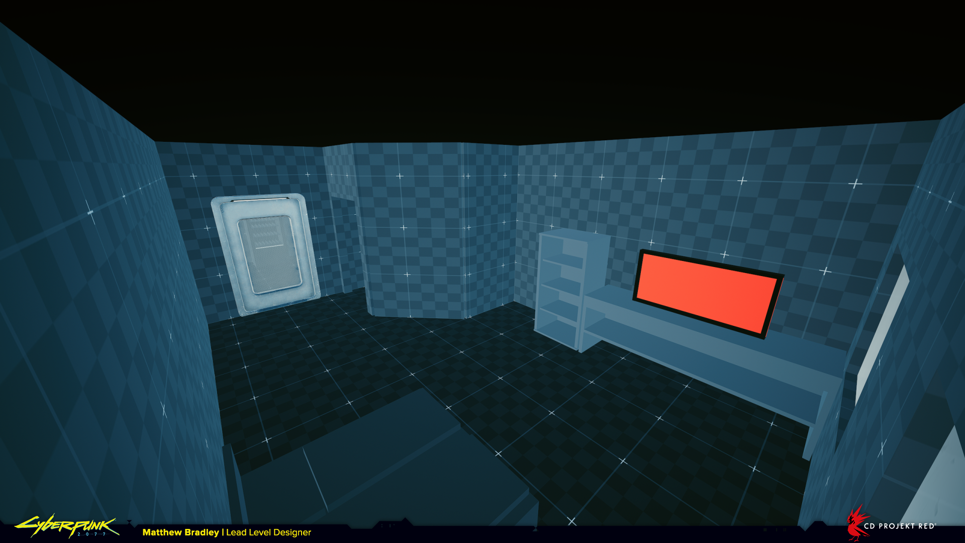
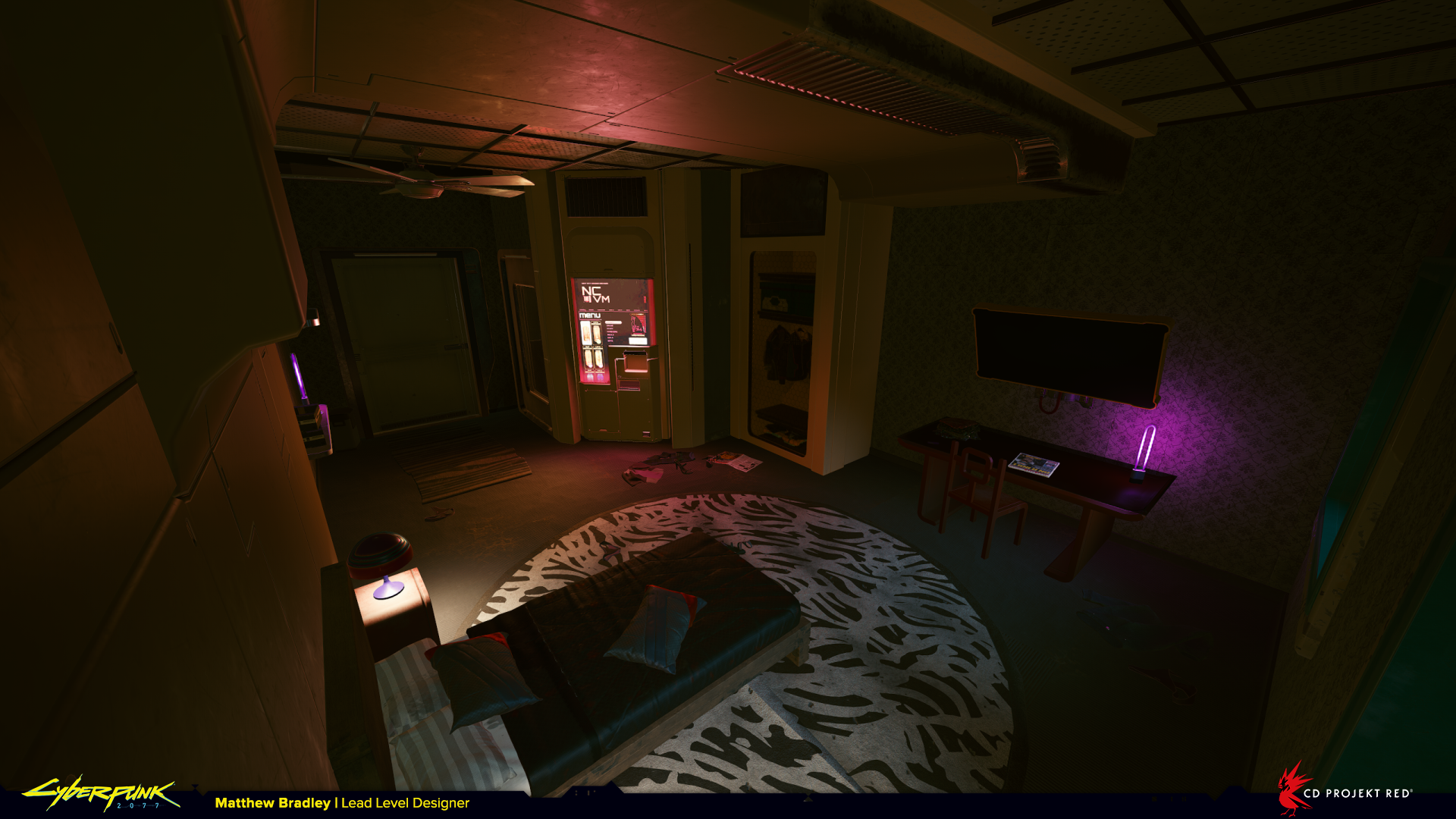
On the top floor of the motel we find three rooms knocked through into one larger space containing a makeshift drugs factory. In the blockout I’m trying to tell the story of what happened to the building, so you can see studwork walls placed to outline where the walls of a normal room would have been before they were ripped out. Again you can see the contrast in detail and legibility between the two shots.
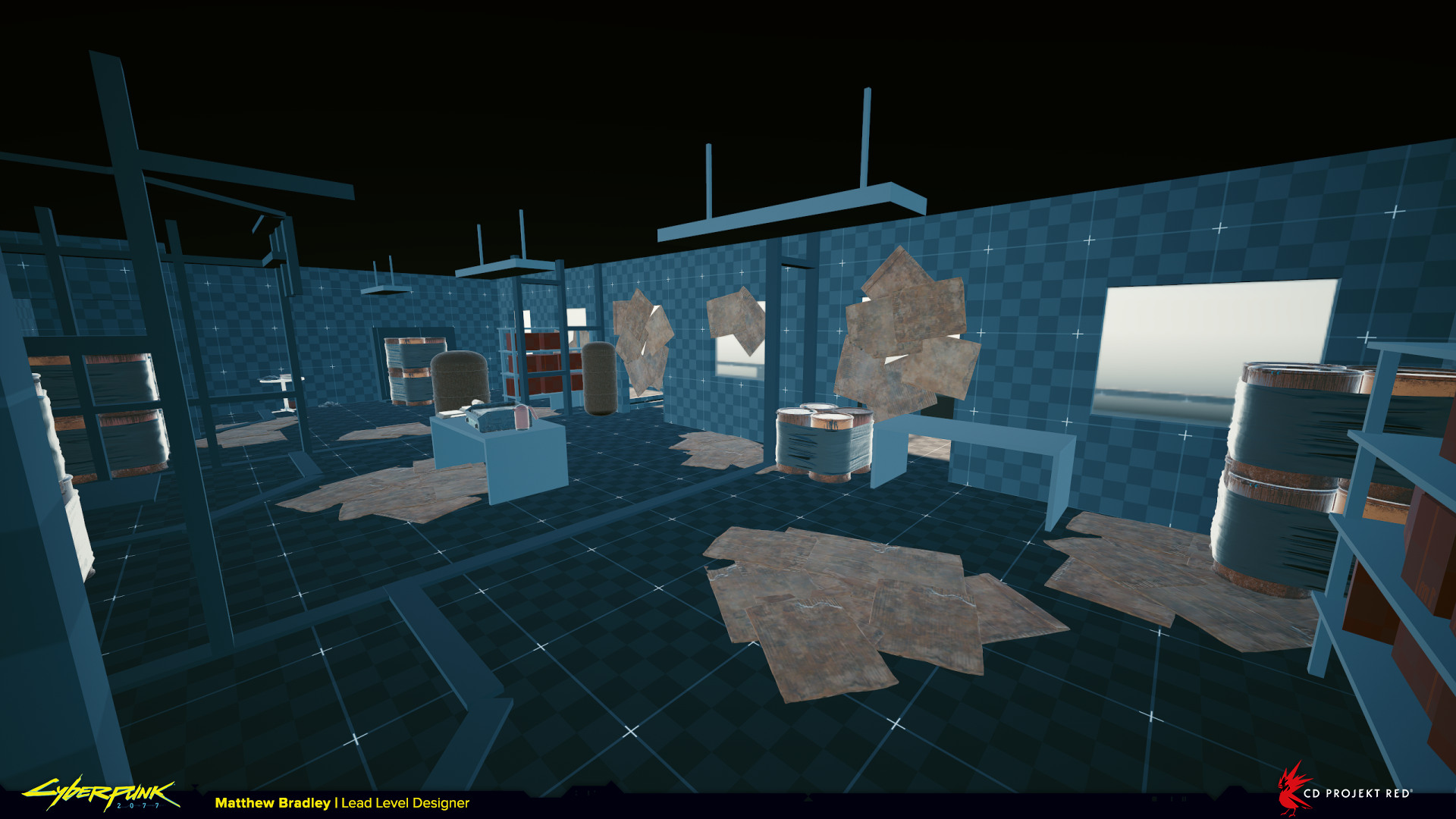
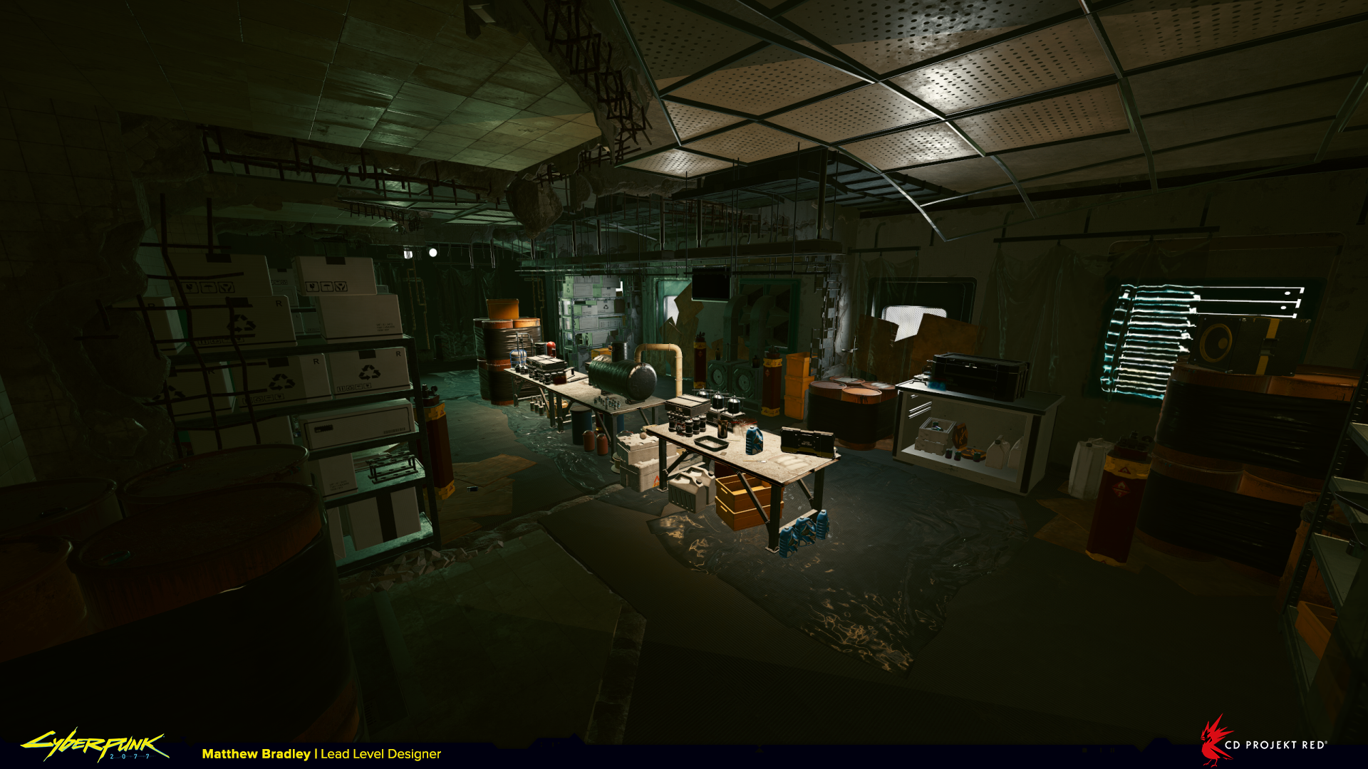
Abandoned TV Studio from ‘Freedom of the Press’
This was a fun level and one of my favourites to work on. The player has to rescue Max Jones (a conspiracy theorist broadcasting inflammatory material from an abandoned TV studio) from an imminent attack, but he’s rigged the studio with traps to defend against intruders.
There are two layers to this: If the player is slow and considered they’ll easily spot the traps before getting to them and be able to find a sneaky passage to avoid trouble. If the player isn’t slow they’ll run right into the traps and have to take immediate evasive action. For me both scenarios are interesting and provided for in the level design.
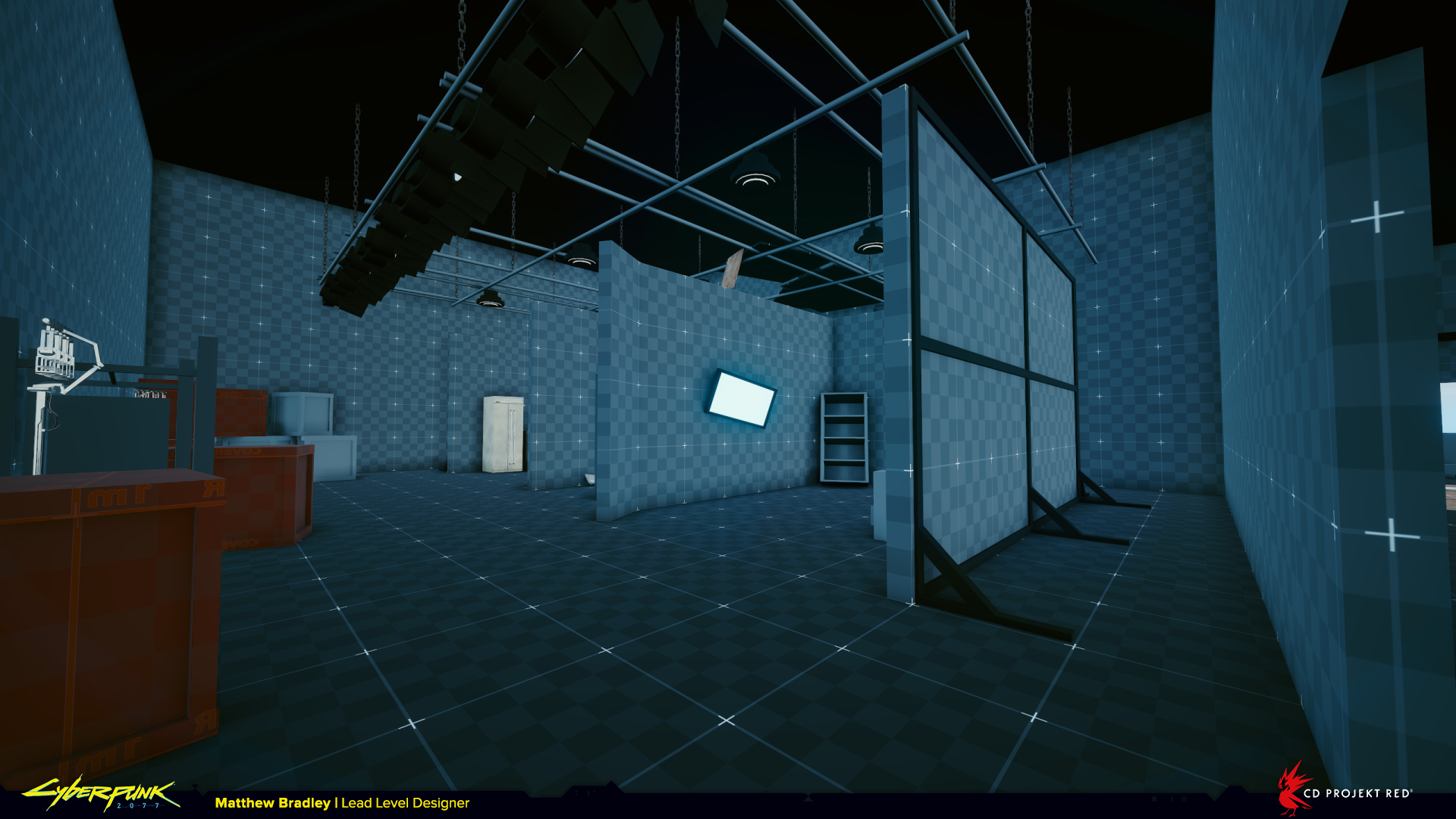
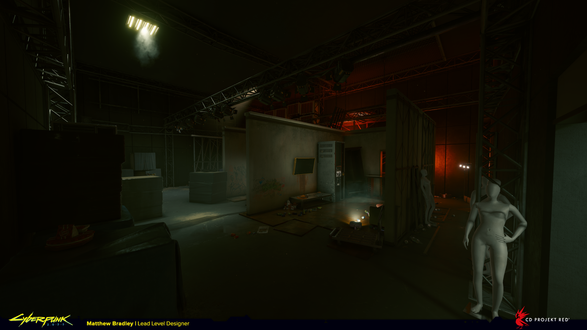
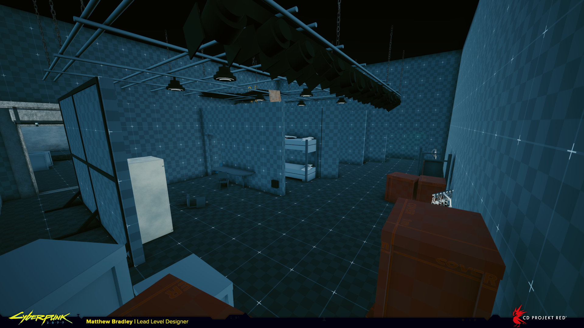
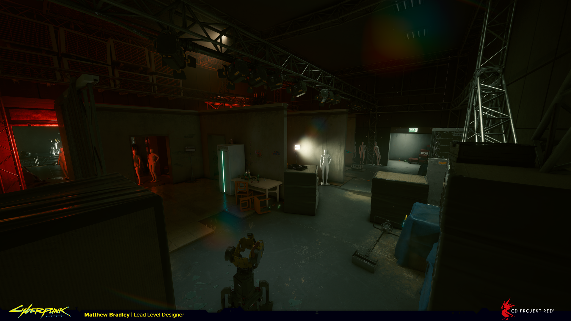
It’s tricky to sell atmosphere and emotion in a blockout, that usually comes much later when the environment is dressed and lit. Good reference really helps communicate to the rest of the team how you as a designer imagine it to be. You can see we wanted this space to feel a bit creepy to reinforce Max’s character.
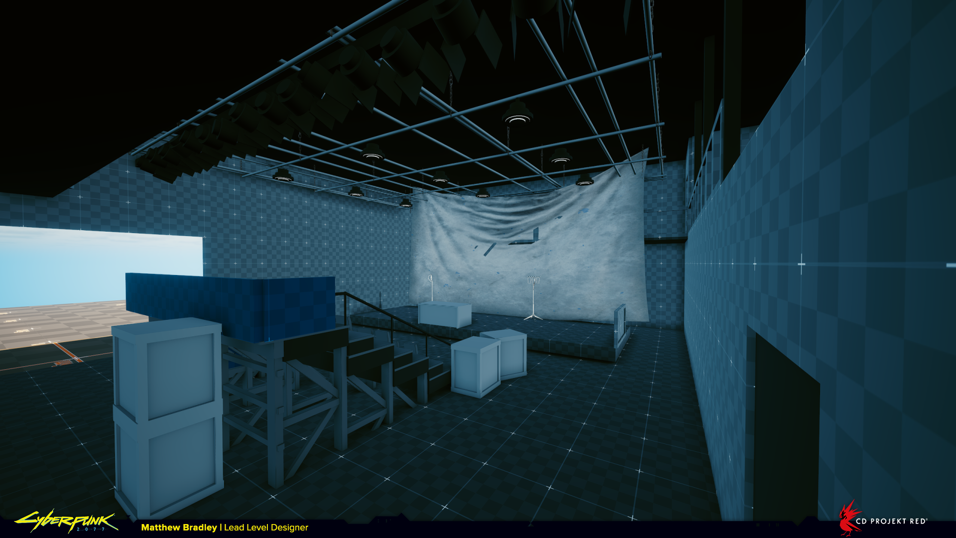
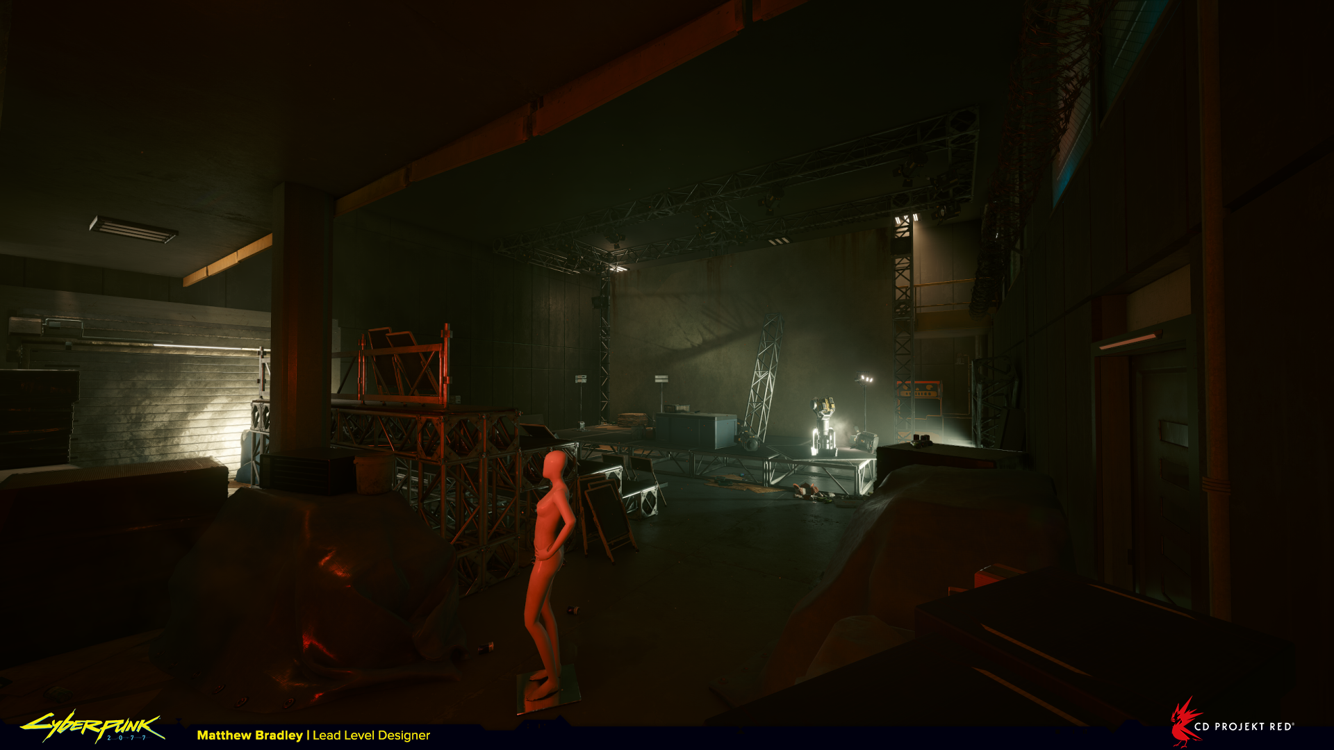
Here the lighting works well to help the player understand the space. We can see lights behind the screen which subtly tells us we can go there, the main threat is highlighted, as is the path around the back of the stand. In the last screenshot there is a very obvious light on the exit in the top right.
And that’s all for part 1. There’ll be another batch of before and after shots in the very near future, as well as some more general shots of environments from Cyberpunk 2077 and other cool level design stuff.
If you want to see more follow, like, subscribe, it really helps!
Thanks,
Matt

